Account aggregation

Created and deployed tools that enable users to connect external accounts, providing a comprehensive view of their finances.

TIMELINE

February 2022 - March 2024

ROLE

Lead designer

TOOLS

Figma

Miro

Jira

UserzoomGO

STATUS

Shipped

🚢

TIMELINE

February 2022 - March 2024

ROLE

Lead designer

TOOLS

Figma

Miro

Jira

UserzoomGO

STATUS

Shipped

🚢

TIMELINE

February 2022 - March 2024

ROLE

Lead designer

TOOLS

Figma

Miro

Jira

UserzoomGO

STATUS

Shipped

🚢

TIMELINE

February 2022 - March 2024

ROLE

Lead designer

TOOLS

Figma

Miro

Jira

UserzoomGO

STATUS

Shipped

🚢

Introduction

Context

By being part of the U.S. individual customer experience (USIX) team, our goal is to instill a feeling of financial security, confidence, and well-being, by making it easier for our customers to manage the money in their accounts and make meaningful financial decisions. By introducing account aggregation into the USIX experience, we enable users to view their entire financial picture, helping them understand and manage their finances in an organized and accurate manner.

My role and my team

As the design lead on this project, I worked closely with the product manager, engineers, Envestnet | Yodlee (financial data aggregation) team, and the compliance team to help uncover customer pain points while considering the technical constraints of this work. I was involved in all stages of the project, including UX research, discovery, design, and production. I held workshops to define project goals and features, constructed low to high fidelity prototypes, conducted usability testing, and handled design QA onto production.

As the design lead on this project, I worked closely with the product manager, engineers, Envestnet | Yodlee (financial data aggregation) team, and the compliance team to help uncover customer pain points while considering the technical constraints of this work. I was involved in all stages of the project, including UX research, discovery, design, and production. I held workshops to define project goals and features, constructed low to high fidelity prototypes, conducted usability testing, and handled design QA onto production.

Problem

Business problem

  • Principal wants a comprehensive view of the customer so that they can increase revenue and sell more products.

Customer problem

  • Customers want a holistic view of their financial accounts.

  • Customers want the most up to date and accurate data (account balances, account details) without having to log into different locations.

Objective

Provide the tools for individuals to link their accounts and give them a holistic view of their finances. The progress of this work will be assessed by analyzing the number of unique users linking an account, as well as by analyzing the conversion rate of users linking an account.


Following features are designed and created to support aggregation:

  • Aggregation through FastLink

  • Linked accounts card

  • Your financial picture card

  • Linked accounts page

Impact

Unique users linking an account

Date

02-07-2023

04-03-2023

06-05-2023

07-10-2023

10-24-2023

12-04-2023

03-12-2024

Unique users

24

188

3,418

9,922

17,766

20,410

41,745

Conversion rate of linking an account

Date

02-27-2023

04-24-2023

06-05-2023

08-14-2023

10-23-2023

12-25-2023

03-17-2024

Conversion rate

50%

69.52%

70.23%

69.05%

71.69%

72.58%

76.58%

We were able to reach 40,000 unique users by mid-March and achieve a 76% linking rate.

Research

Feature prioritization

We utilized the feature prioritization framework to rank and organize features that we wanted to develop for our first MVP. These features were carefully selected based on customer value, business goals, the amount of time and cost, and technical viability of the project.


Six features that we wanted to prioritize are listed here:

  1. Give customers the ability to link their accounts - with other financial institutions.

  2. Give customers the ability to view account and its balance by categories (assets & liabilities).

  3. Give customers the ability to view account and its balance by sub-categories (investments, cash, credit cards, loans).

  4. Give customers the ability to force refresh a linked account.

  5. Give customers the ability to delete a linked account.

  6. Give customers the ability to edit a linked account.

Competitors analysis

As part of my competitive analysis, I identified the strengths, weaknesses, and key features of our indirect and direct competitors. I am also leveraging this process to understand feature requirements, while also learning from our competitor’s mistakes to innovate and enhance our product.

Design sprints

Weekly design sprints were done to facilitate collaboration between stakeholders and cross-departments. Product managers, engineers, designers, Envestnet | Yodlee (financial data aggregation) team all contributed innovative ideas with the goal staying on track and improving our customer’s experience.

First iteration

With our introduction of account aggregation into the USIX experience, this first iteration starts by solving a few basic customer problems and providing them a way to view their finances in an organized and accurate way. Here are the following features that are designed and created to support aggregation:

  • Integration with FastLink

  • Linked account cards

  • Your financial picture card

  • Linked accounts page

Integration with FastLink

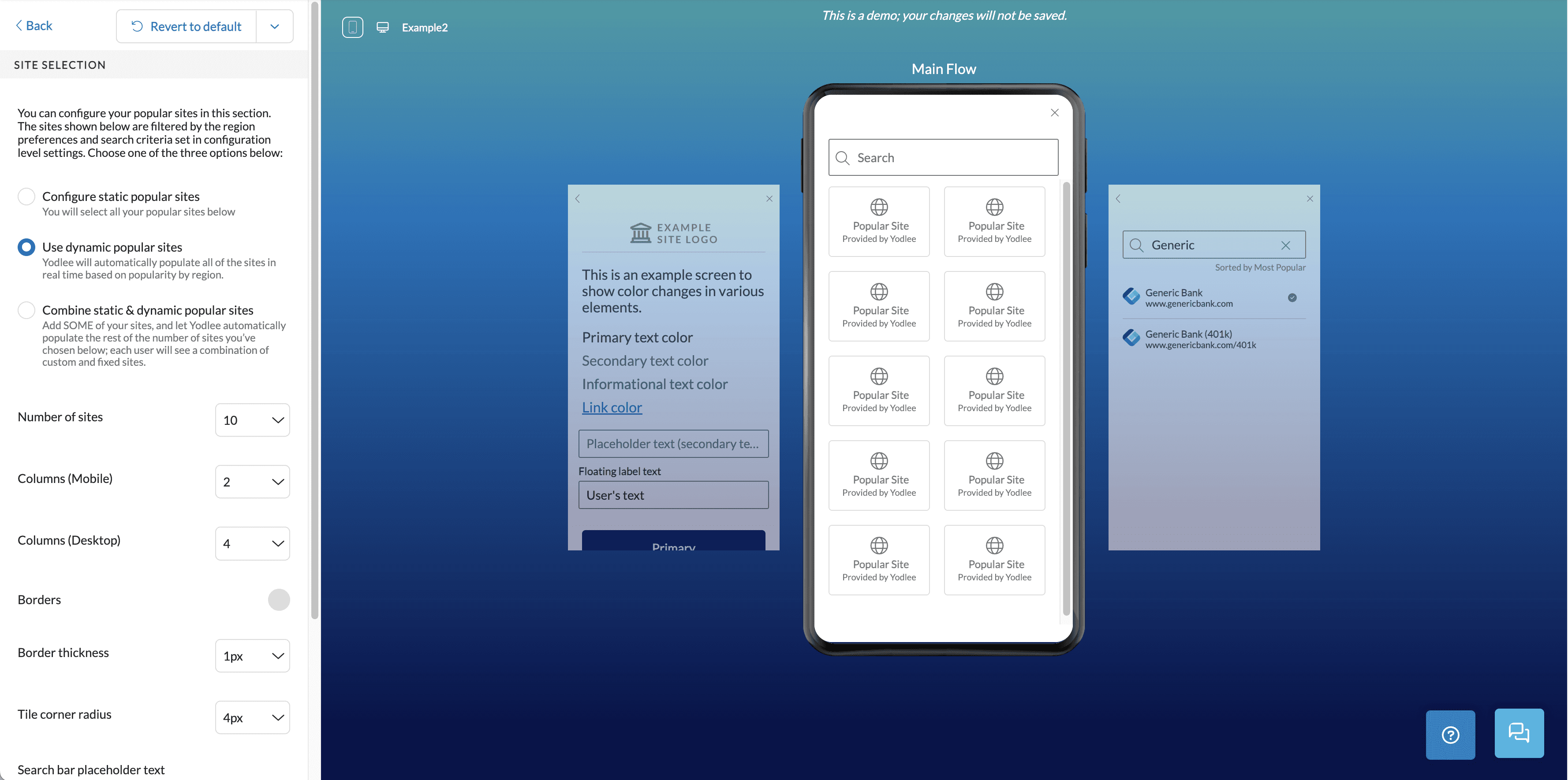
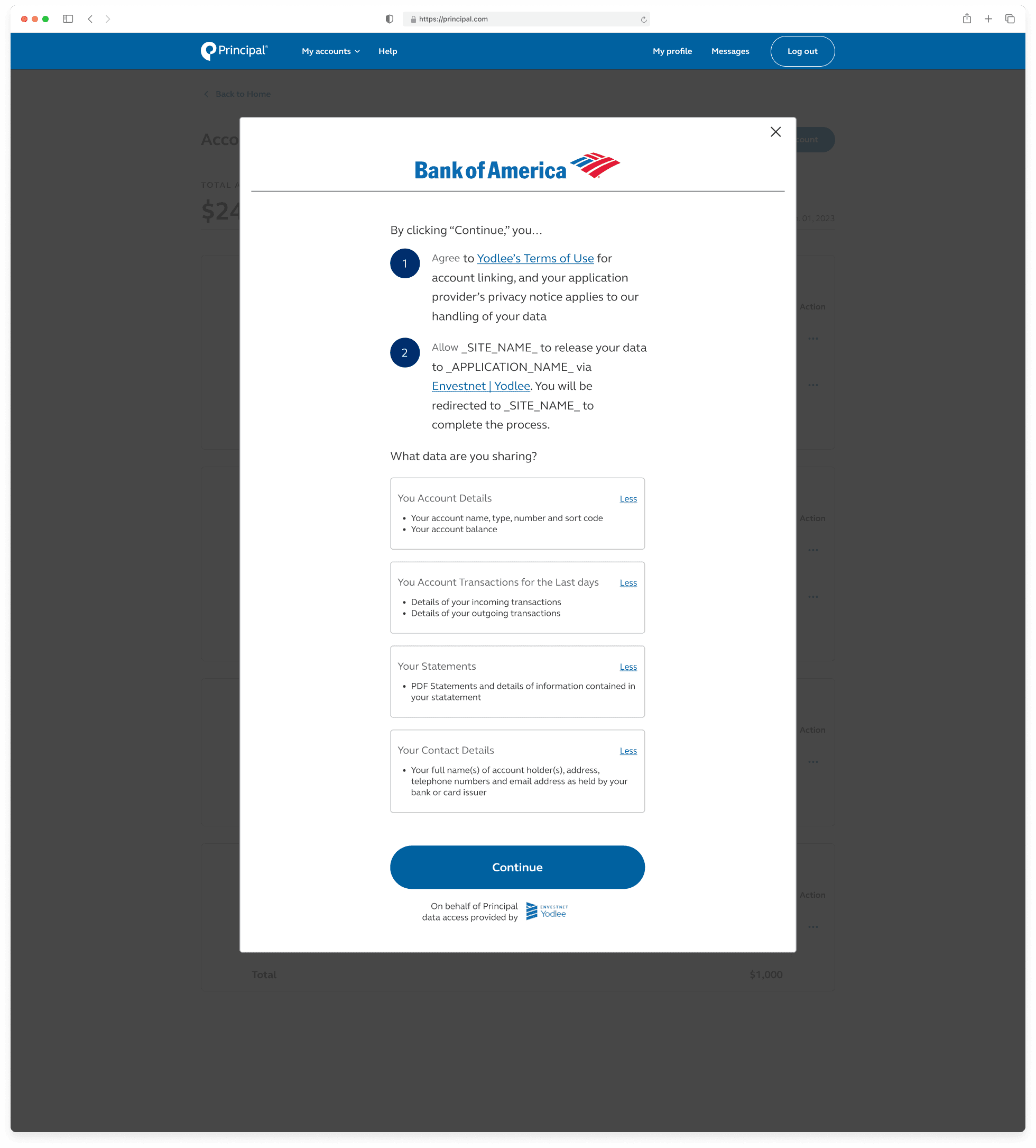
FastLink is a responsive application that facilitates linking user accounts to the PFG application. I utilized the FastLink Configuration tool to customize font, text color templates, borders, buttons, entry field shapes, corner radius, and more. This was done to make sure aggregation tool aligned to Principal’s design system and brand.

Linked account cards

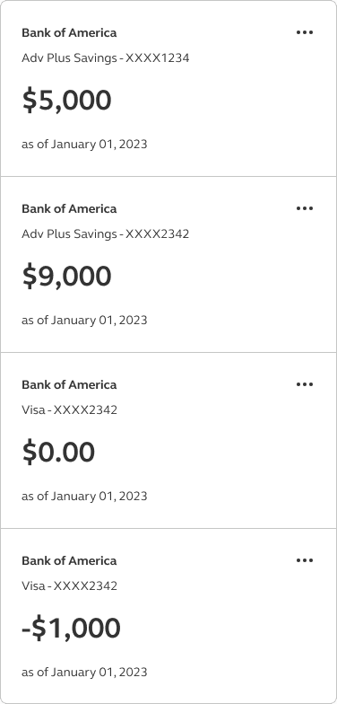
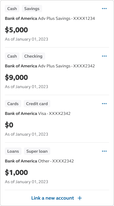
Our initial design of the linked account cards included company name, account name, account number, account balance. These were standard data points and information shown on linked account cards.

“Your financial picture” card

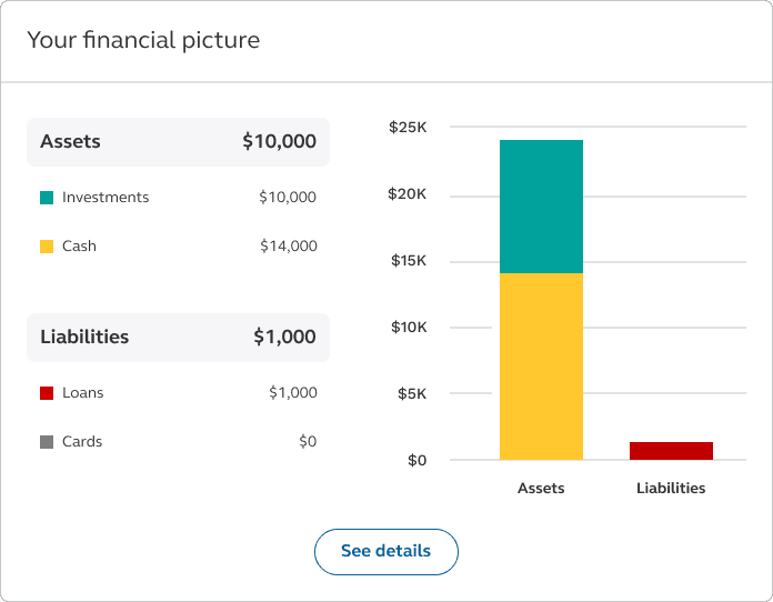
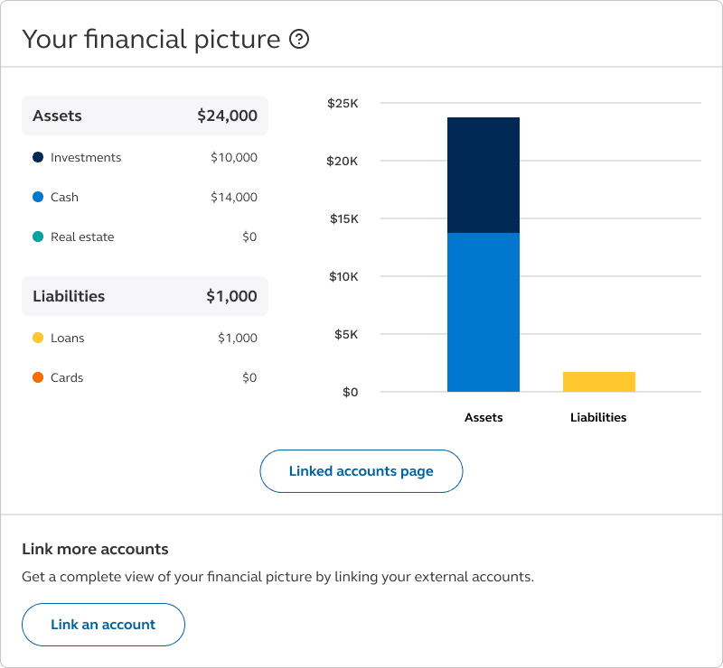
The first design of “Your financial picture” module will give our customers an overview of their Principal accounts alongside their linked accounts from outside financial institutions. All of the accounts will be added up by their categories and subcategories (Assets - Investments, Cash, Liabilities - Cards, Loans)

Linked accounts page

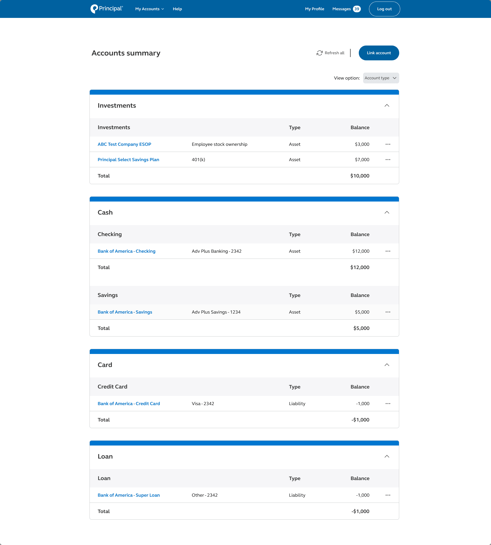
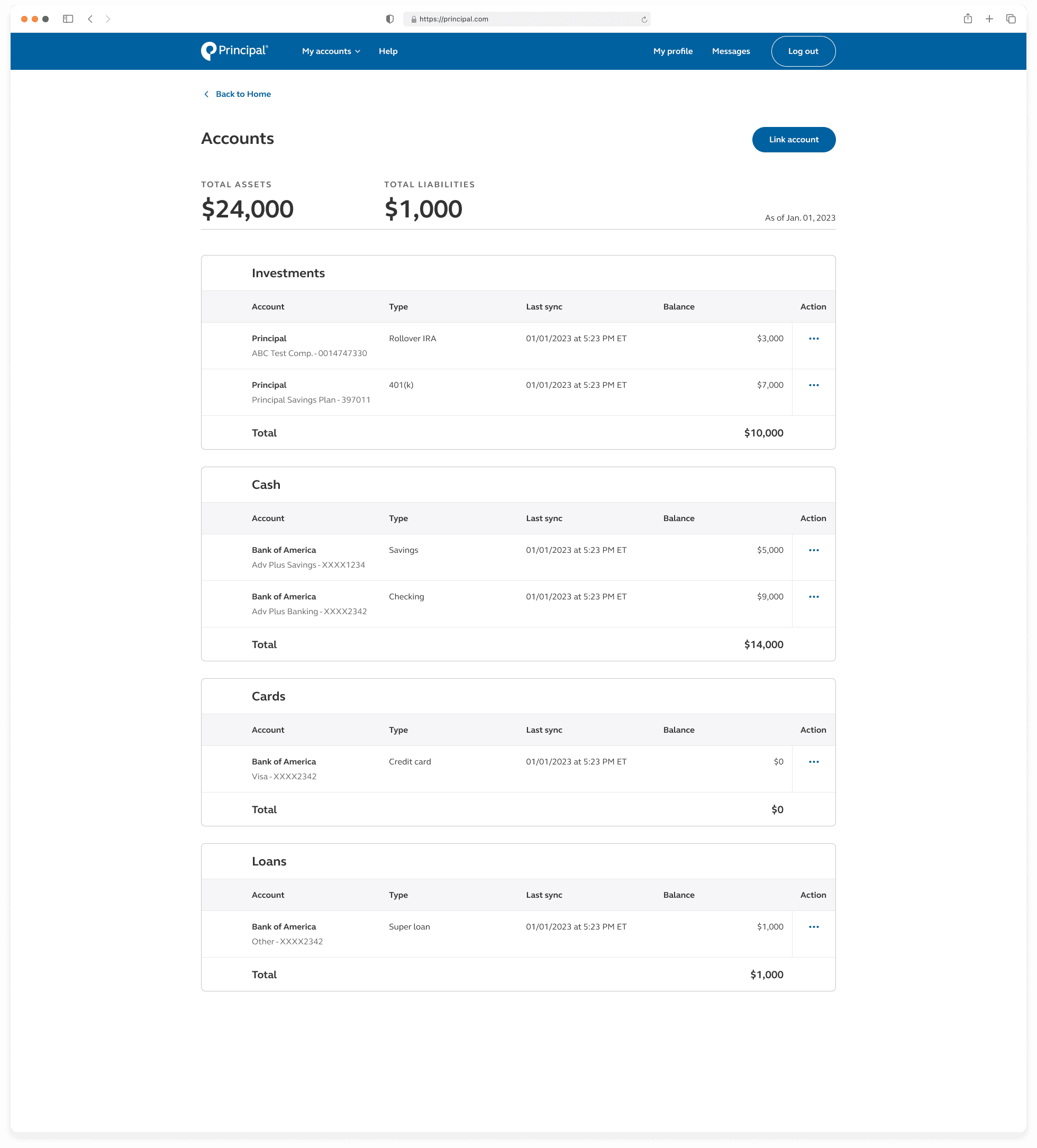
A place for users to see a list of their linked accounts with actions to edit, refresh, and delete an account.

Integration with FastLink

FastLink is a responsive application that facilitates linking user accounts to the PFG application. I utilized the FastLink Configuration tool to customize font, text color templates, borders, buttons, entry field shapes, corner radius, and more. This was done to make sure aggregation tool aligned to Principal’s design system and brand.

Linked account cards

Our initial design of the linked account cards included company name, account name, account number, account balance. These were standard data points and information shown on linked account cards.

“Your financial picture” card

The first design of “Your financial picture” module will give our customers an overview of their Principal accounts alongside their linked accounts from outside financial institutions. All of the accounts will be added up by their categories and subcategories (Assets - Investments, Cash, Liabilities - Cards, Loans)

Linked accounts page

A place for users to see a list of their linked accounts with actions to edit, refresh, and delete an account.

User testing

Goal: Understand the type of information that participants would gain from linking their accounts

Tool: Userzoom Go

Number of users: 16

Metric: Qualitative feedback


Through these interviews, our aim was twofold: firstly, to understand the perceived value users would derive from linking their accounts, thereby assessing the utility and significance of this feature; and secondly, to gather insightful first impressions regarding the efficacy and usability of the designs we presented. By examining the users' perspectives and reactions, we aimed to refine and optimize our designs to better meet their needs and expectations.

Final designs

Integration with FastLink

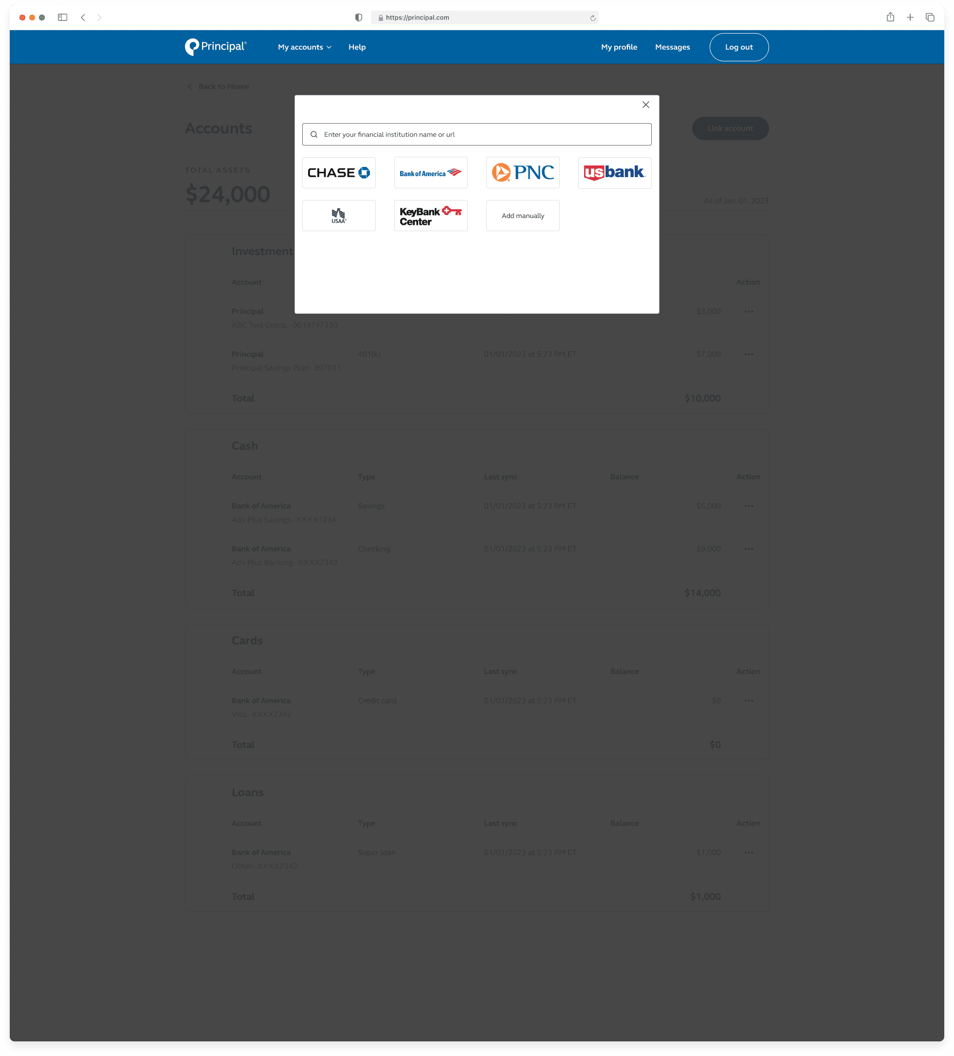
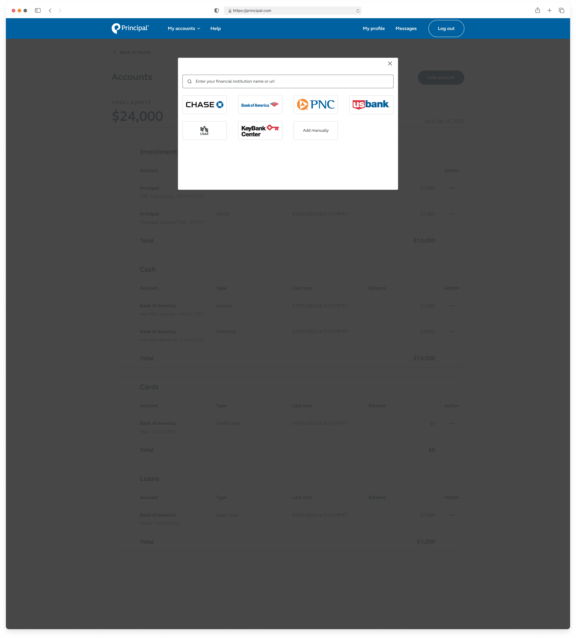
Consumers have multiple options for finding and adding sites on the platform. They can either search for sites using the default search field located at the top of the page or select a site by tapping/clicking on its corresponding popular site logo icon. Additionally, consumers have the flexibility to manually add accounts from all regions and real estate accounts specifically from the US.

Linked accounts cards

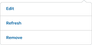
The finalized linked accounts cards introduces two additional key features. To help customers identify their account categories and subcategories, lozenges are added as the first feature. Lozenges are a visual indicator used to highlight an item’s status for quick recognition. Users also have access to controls and actions through the "more" icon within the linked account cards. Tapping/clicking on the icon serves the user three actions — edit, refresh, and delete.

"Your financial picture" card

Testing showed that this design was simple and easy to understand. However, there was some confusion regarding the call-to-action button. The button's label was improved to clearly communicate its destination to the user.

Linked accounts page

Users can view a list of their linked accounts separated into different categories. Additionally, users can edit, refresh, and delete individual accounts. If there is an error with an account, a banner and an alert icon will be displayed.

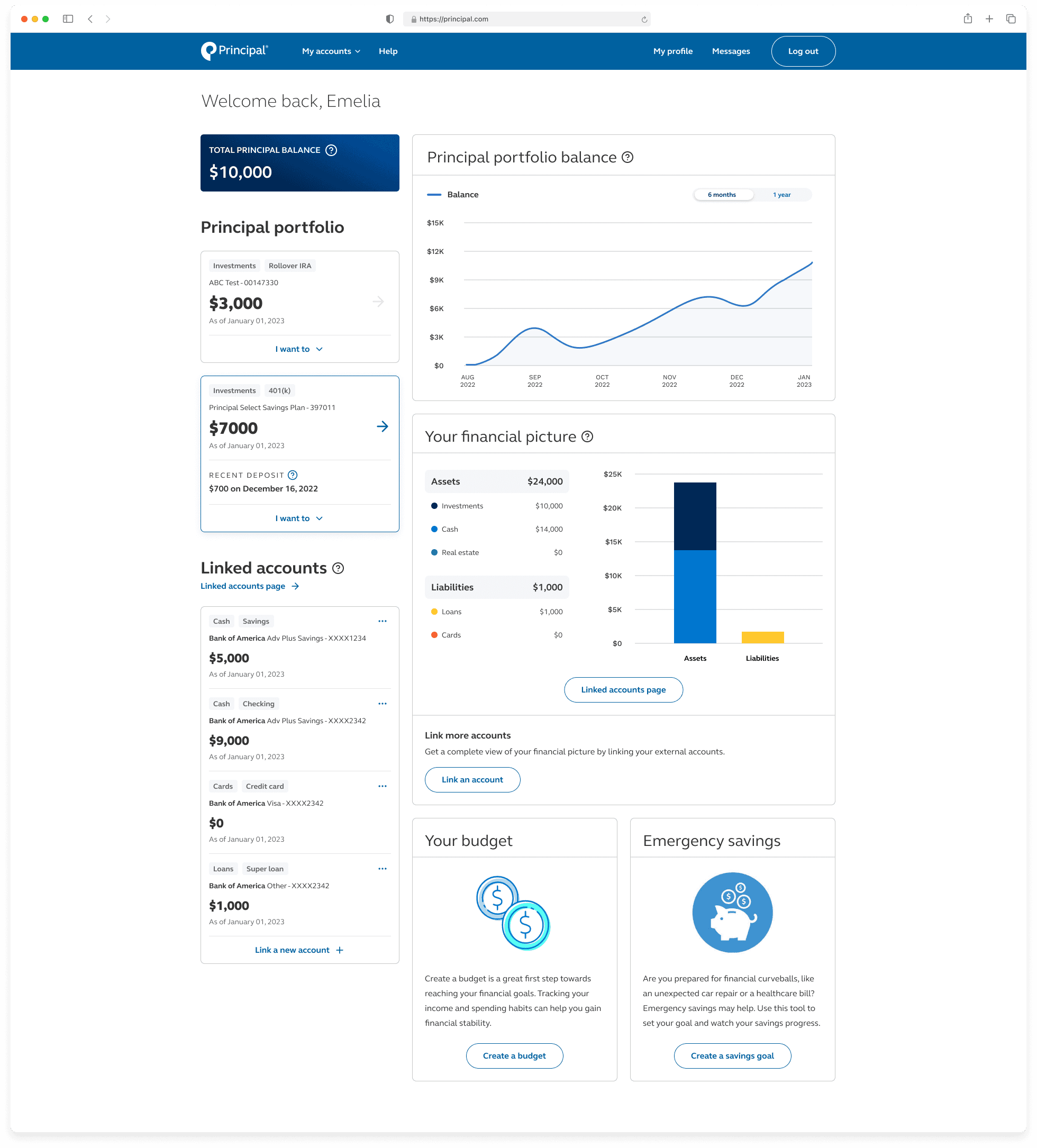
Dashboard page - tying the experience all together!

A new and improved dashboard page with support for linking external accounts.

Conclusion

Takeaways

Designing with constraints

Designing this experience presented unique challenges, requiring me to navigate between multiple stakeholders' interests. Balancing user requirements alongside business priorities was particularly complex, as I had to ensure that my designs integrated with existing functionalities while still addressing user needs effectively.

Cross-functional collaboration

I gained a ton of knowledge working with engineers, PM, and other stakeholders on this project. Their input is invaluable in guiding and backing decisions. I learned by fostering open dialogue and leveraging each team member's expertise, we were able to streamline development processes and deliver more cohesive and successful outcomes.

Designing different UI states

In designing UI screen states for linking external accounts, I discovered the importance of anticipating and addressing various user scenarios. Some of the states that went into this work involved designing the ideal state, error state, loading state, and impartial state. This process highlighted the need for clear, concise messaging to guide users through each state, ensuring a seamless experience regardless of the outcome.

Next steps

Bug fixes

We will prioritize addressing any identified bugs and issues to enhance the overall stability and functionality of the product. Our focus will be on conducting usability testing, implementing necessary fixes, and ensuring a seamless user experience across all platforms.

Additional features

In the upcoming phase, we'll concentrate on implementing additional features to enrich the user experience and expand the product's capabilities. This involves gathering requirements, prototyping, and iteratively developing new functionalities to meet user needs and enhance product value.
Copyright

2024 by Ryan La.

All rights reserved.

Contact

ryanla0227@gmail.com

Location

Orange County, CA

Copyright

2024 by Ryan La.

All rights reserved.

Contact

ryanla0227@gmail.com

Location

Orange County, CA

Copyright

2024 by Ryan La.

All rights reserved.

Contact

ryanla0227@gmail.com

Location

Orange County, CA

Integration with FastLink

Consumers have multiple options for finding and adding sites on the platform. They can either search for sites using the default search field located at the top of the page or select a site by tapping/clicking on its corresponding popular site logo icon. Additionally, consumers have the flexibility to manually add accounts from all regions and real estate accounts specifically from the US.

Linked accounts cards

The finalized linked accounts cards introduces two additional key features. To help customers identify their account categories and subcategories, lozenges are added as the first feature. Lozenges are a visual indicator used to highlight an item’s status for quick recognition. Users also have access to controls and actions through the "more" icon within the linked account cards. Tapping/clicking on the icon serves the user three actions — edit, refresh, and delete.

"Your financial picture" card

Testing showed that this design was simple and easy to understand. However, there was some confusion regarding the call-to-action button. The button's label was improved to clearly communicate its destination to the user.

Linked accounts page

Users can view a list of their linked accounts separated into different categories. Additionally, users can edit, refresh, and delete individual accounts. If there is an error with an account, a banner and an alert icon will be displayed.

Integration with FastLink

Consumers have multiple options for finding and adding sites on the platform. They can either search for sites using the default search field located at the top of the page or select a site by tapping/clicking on its corresponding popular site logo icon. Additionally, consumers have the flexibility to manually add accounts from all regions and real estate accounts specifically from the US.

Linked account cards

The finalized linked accounts cards introduces two additional key features. To help customers identify their account categories and subcategories, lozenges are added as the first feature. Lozenges are a visual indicator used to highlight an item’s status for quick recognition. Users also have access to controls and actions through the "more" icon within the linked account cards. Tapping/clicking on the icon serves the user three actions — edit, refresh, and delete.

"Your financial picture" card

Testing showed that this design was simple and easy to understand. However, there was some confusion regarding the call-to-action button. The button's label was improved to clearly communicate its destination to the user.

Linked accounts page

Users can view a list of their linked accounts separated into different categories. Additionally, users can edit, refresh, and delete individual accounts. If there is an error with an account, a banner and an alert icon will be displayed.