Delivery preference management
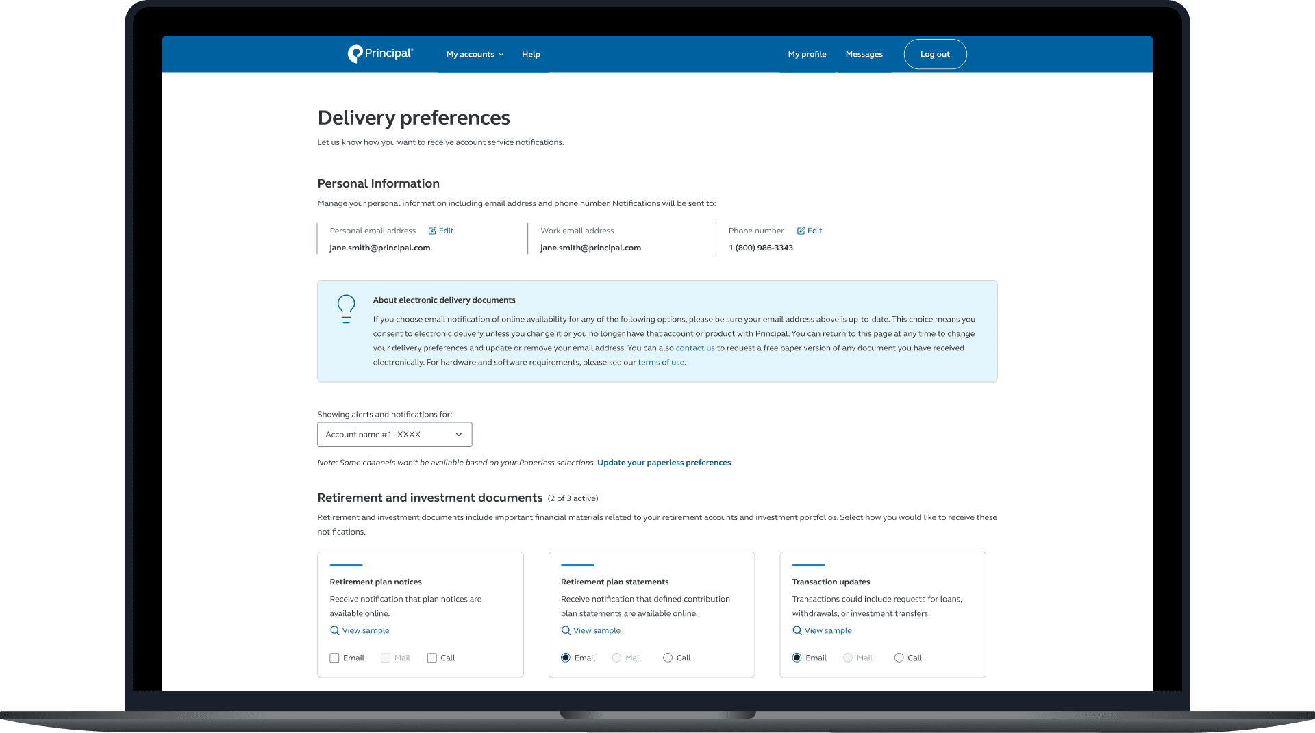
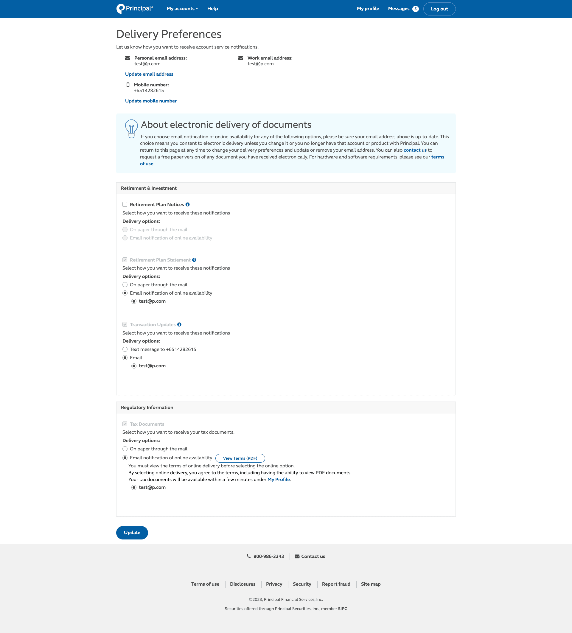
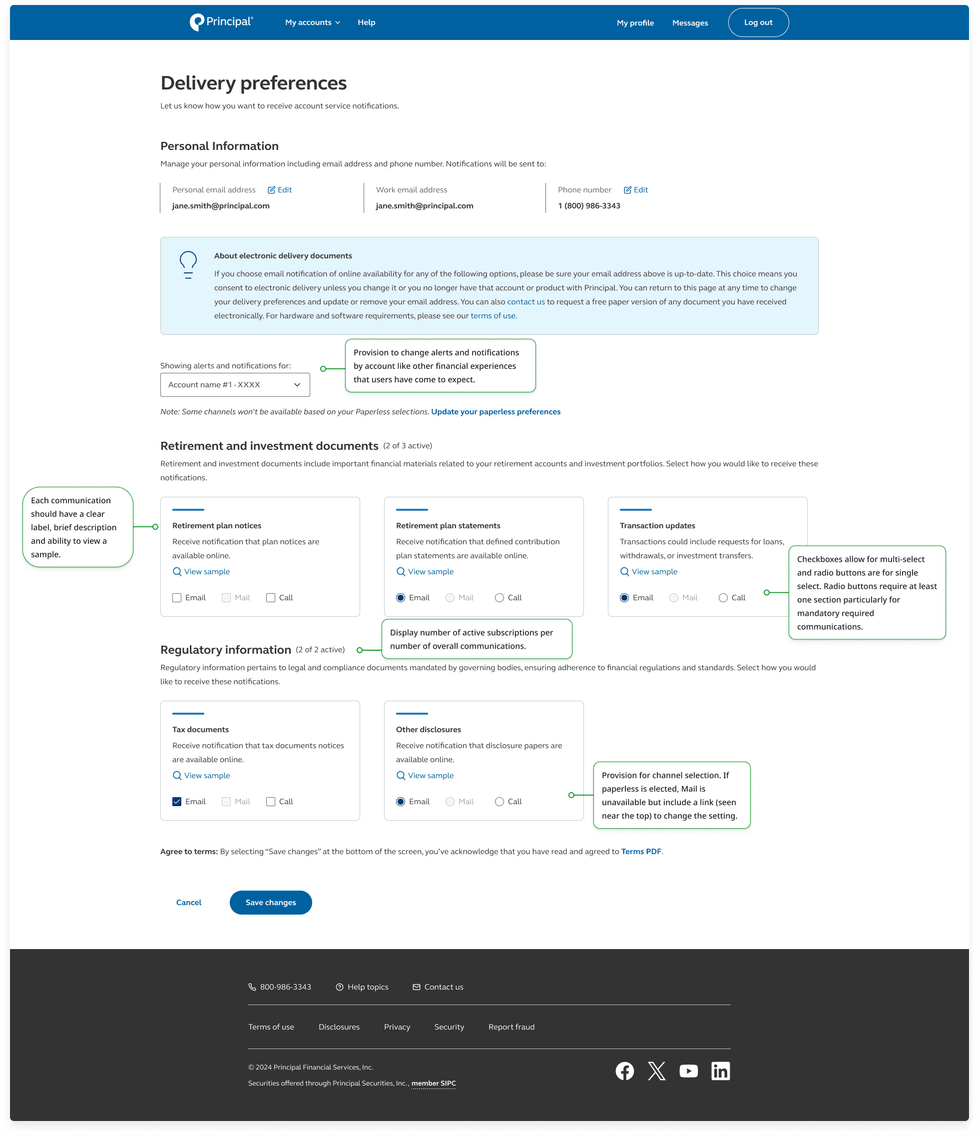
Redesigned how users manage their consent and delivery preferences for various types of activities and communications.
Introduction
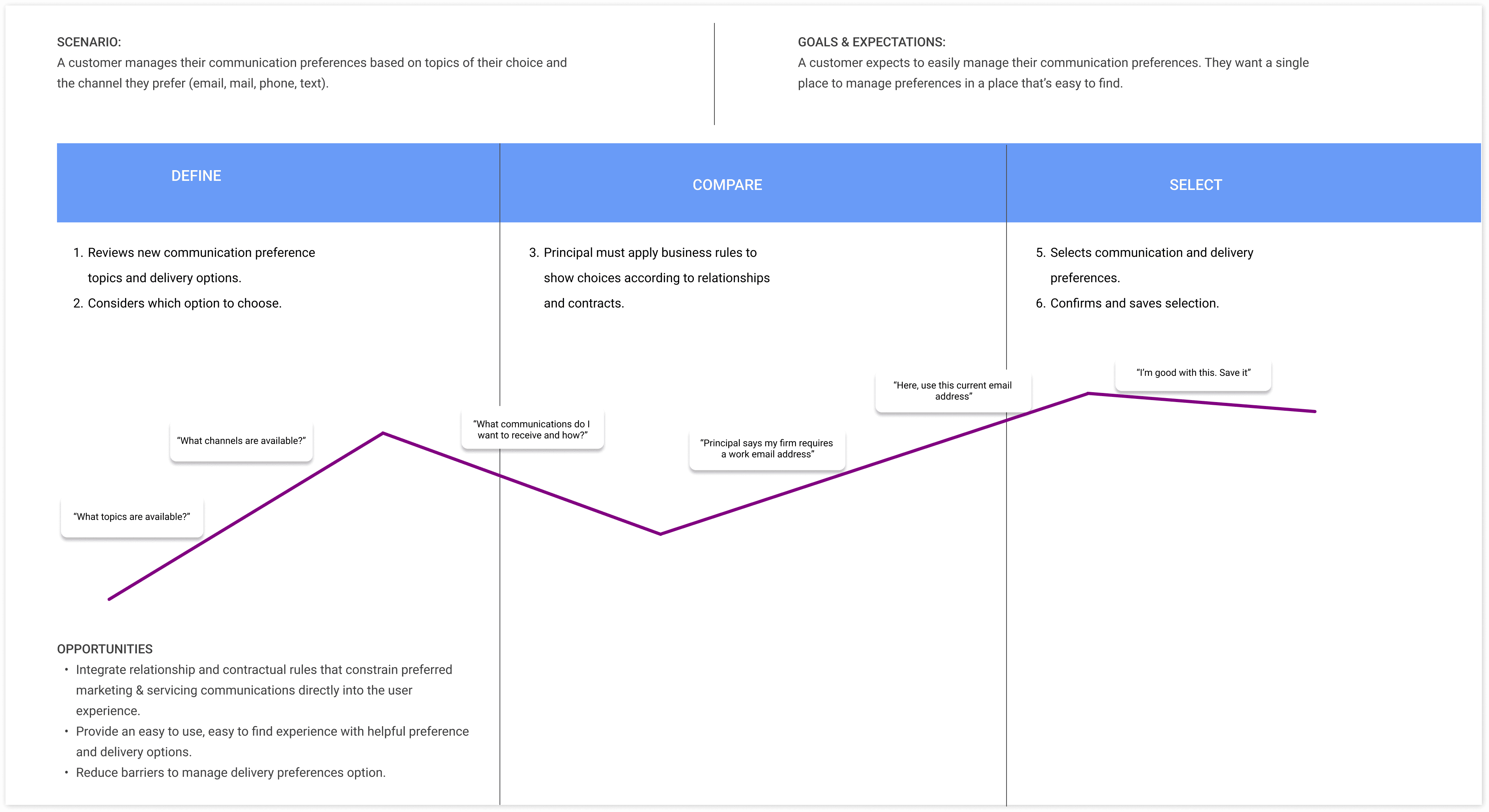
Context
My role and my team
As the design lead on this project, I worked closely with the product manager, engineers, and the PossibleNow team. It was my responsibility to conduct user research, create the designs, and test the products.
Objective

Building an enterprise consent delivery preference management capability which:
Allows us to mitigate risks, including negative brand impact, fines/litigation, customer discontent and mistrust
Unifies our data and creates a central source of truth around all consents and preferences that other enterprise systems can consume
Eliminates siloed, inconsistent manual processes, while allowing us the ability to capture and store consent and preference decisions across multiple channels.
Retain more prospects and customers for marketing communications
User testing #1

Goal: To understand layout preferences and ease of consuming preferences and actions
Tool: UserzoomGo
Number of users: 6
Metric: Qualitative feedback
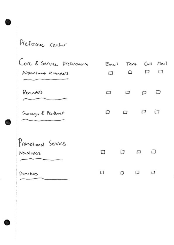
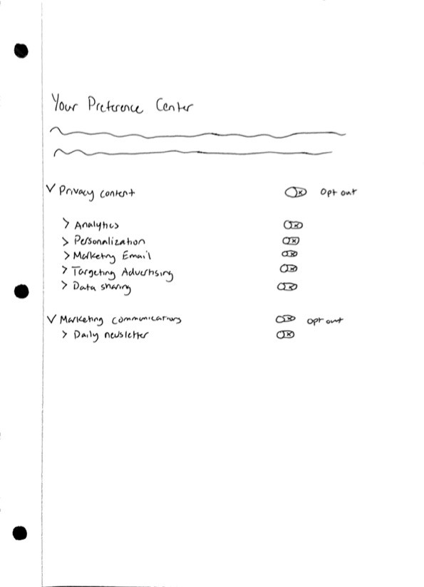
Usability testing played a crucial role in refining our delivery preferences page to ensure optimal user experience. Through testing, we gauged layout preferences and the ease of consuming preferences and actions, allowing us to fine-tune the design for maximum usability. Additionally, we assessed the overall desirability of features, functionality, and content, ensuring that the page met user expectations and needs effectively. Furthermore, usability testing helped determine the hierarchy of preferences offered, preferred communication channels, and the naming of content categories, allowing us to prioritize elements based on user preferences.
Key findings from the testing revealed that:
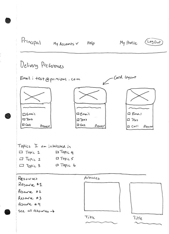
6/6 users preferred the card view over the list view
5/6 users found checkboxes clear for opting in and out
6/6 users said the number of communications did not overwhelm them
6/6 users identified the correct categories and communication channels
Accessibility review

By implementing an accessibility checklist on our delivery preferences page, I ensured an inclusive and universal experience for all users. First, I checked color contrast against WCAG standards, guaranteeing that text and background elements provided sufficient differentiation for users with visual impairments. Additionally, I utilized semantic HTML and heading tags (e.g., H1, H2, H3) in my designs to establish a logical page structure, facilitating smooth navigation and comprehension for screen reader users. Furthermore, I avoided complex interactions, simplifying the interface and ensuring usability for users with cognitive or motor impairments.
Final designs

Conclusion

Takeaways
Data-driven decision making
Simplicity enhances usability
Simplifying interactions and presenting information clearly reduces user frustration and promotes ease of use, leading to higher user satisfaction.
Compliance and security
Next steps
Launch and communication
Plan a launch strategy for the updated delivery preferences page, including communication to users about the changes and any new features or functionality.

