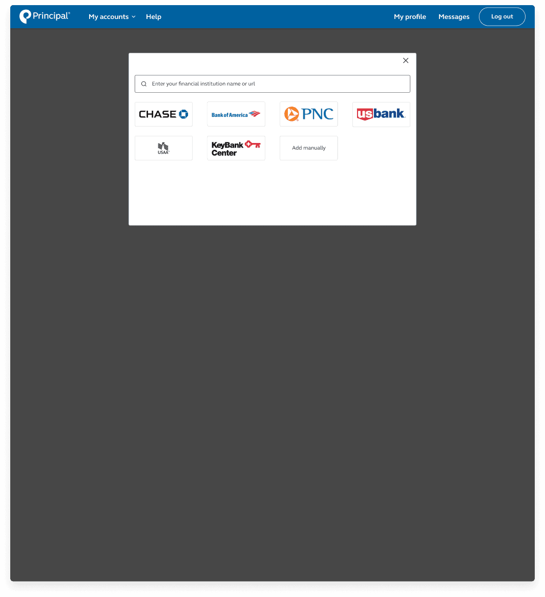
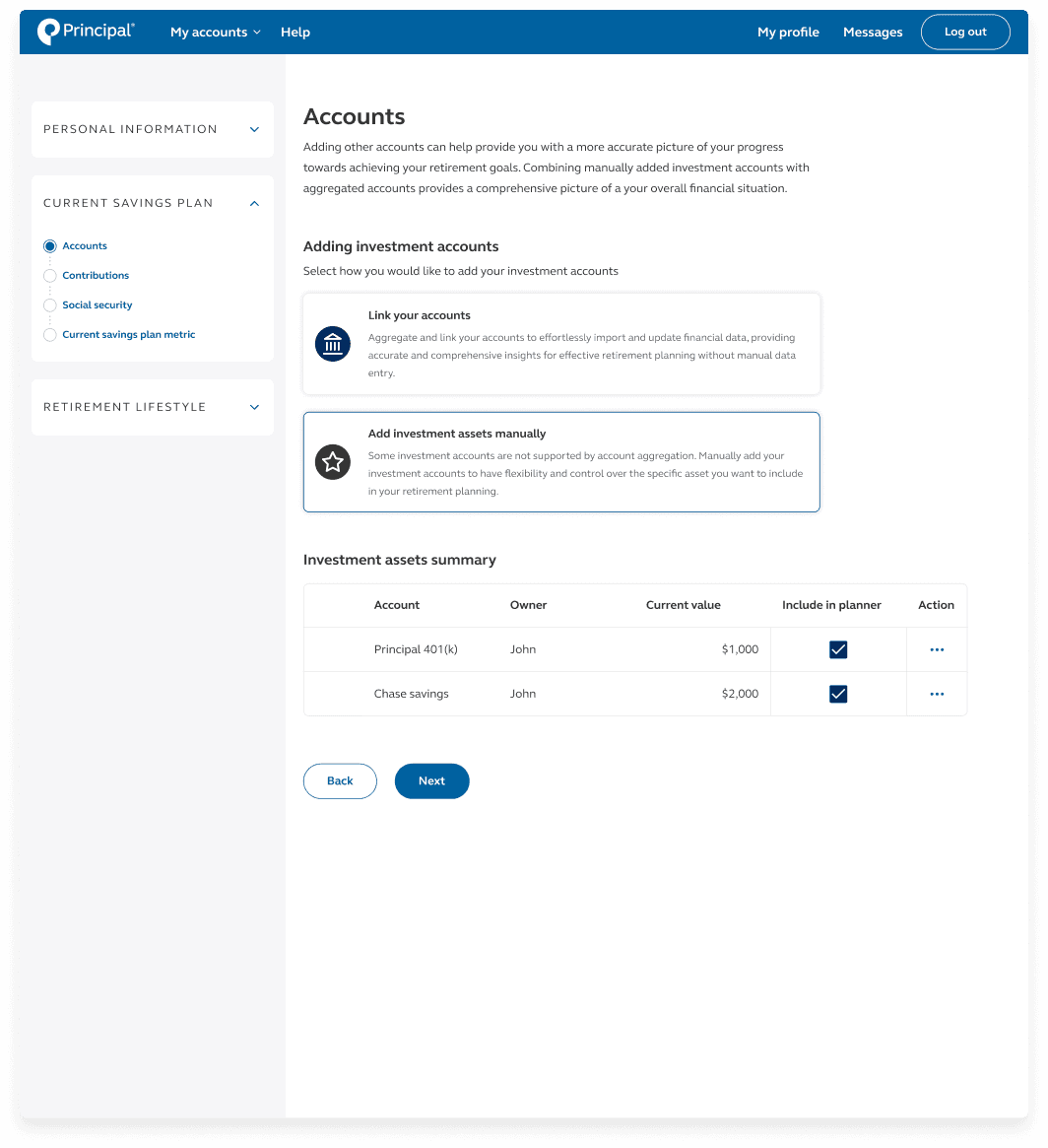
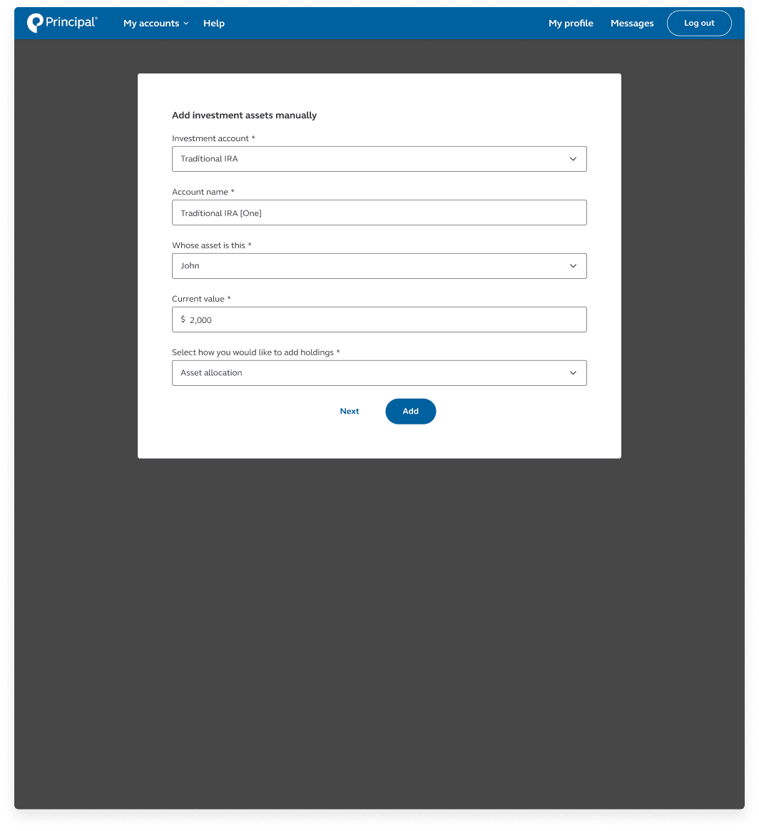
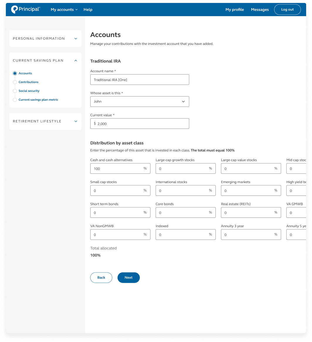
Retirement wellness planner
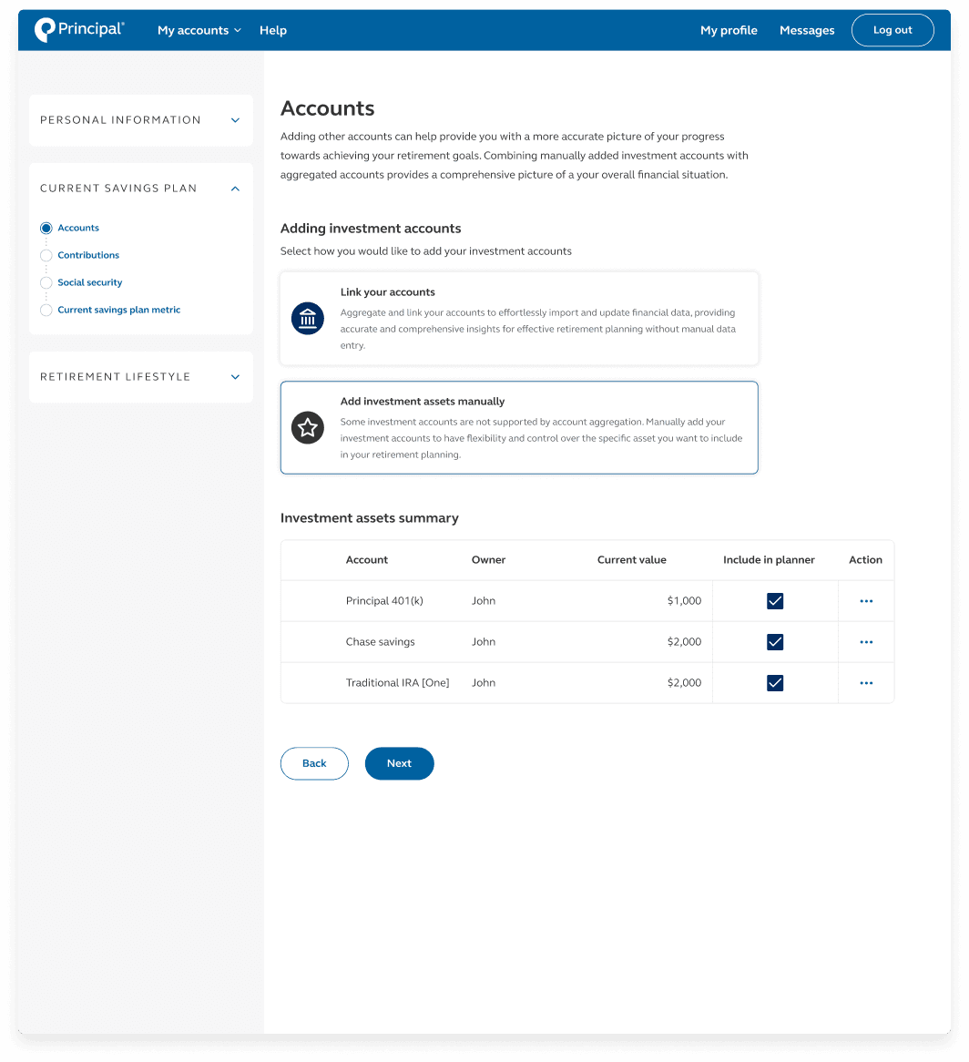
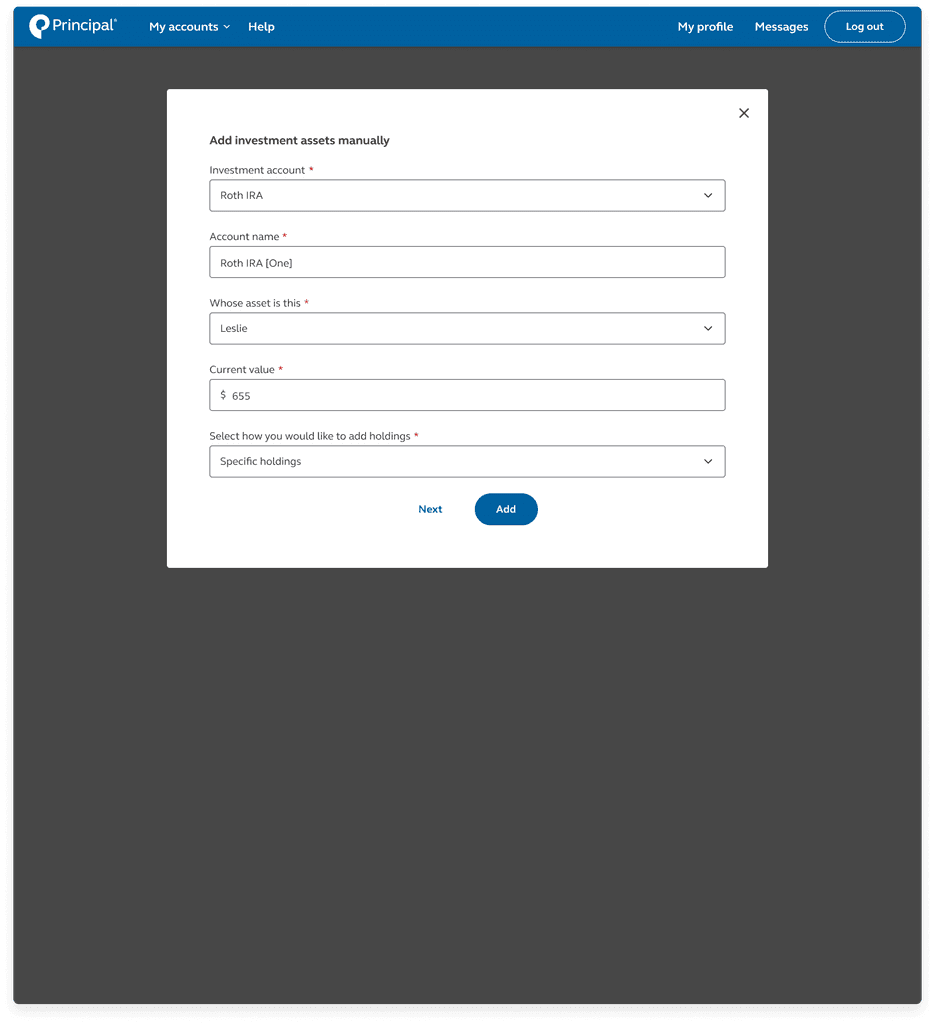
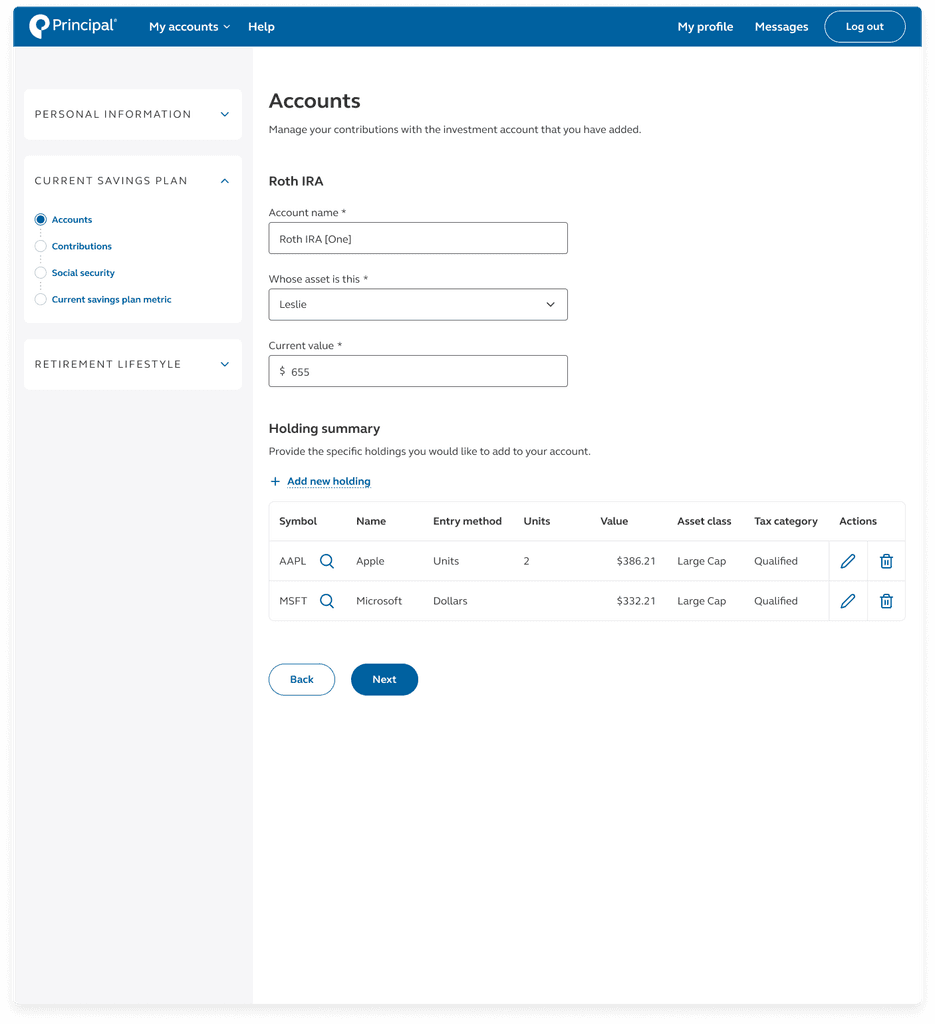
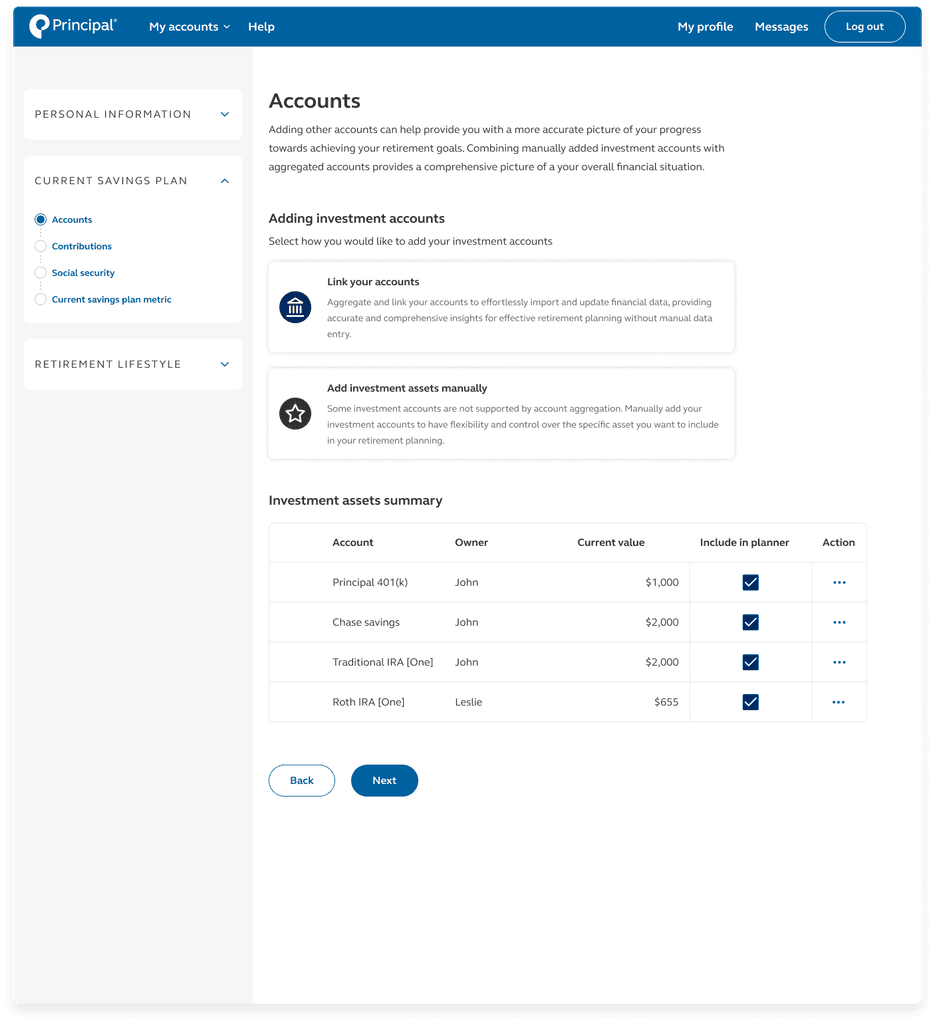
Designed and optimized the user data collection module within Principal Financial Group’s retirement goal-setting and tracking platform.
Introduction

Context
Principal Financial Group is a global financial investment management and insurance company based in the United States. It offers a wide range of financial products and services to both individual and institutional clients. The retirement wellness planner is a tool owned by Principal Financial Group that allows users to set and track their retirement goals. Based on the information collected, this planner calculates a retirement wellness score and shows whether a customer is on track to retire.
UX designer working alongside my manager, senior experience design manager. As part of the retirement wellness planner, I focused on designing the content and structure for the user information gathering section (”quiz”). Two product managers were also working alongside this project.
Problem

Many customers are delaying serious retirement savings due to lack of adequate tools. Customers voice the lack of clarity or complexity in the tools, and a perception that the tools do not adequately address their individual financial situations.
Objective

Understand how users are currently setting and tracking their retirement goals.
Explore the strengths and weakness of today’s retirement wellness planner. Identify pain points and moments that matter.
Uncover opportunities and new strategies for transforming how individuals measure their progress toward retirement goals.
Research

Discover sprints
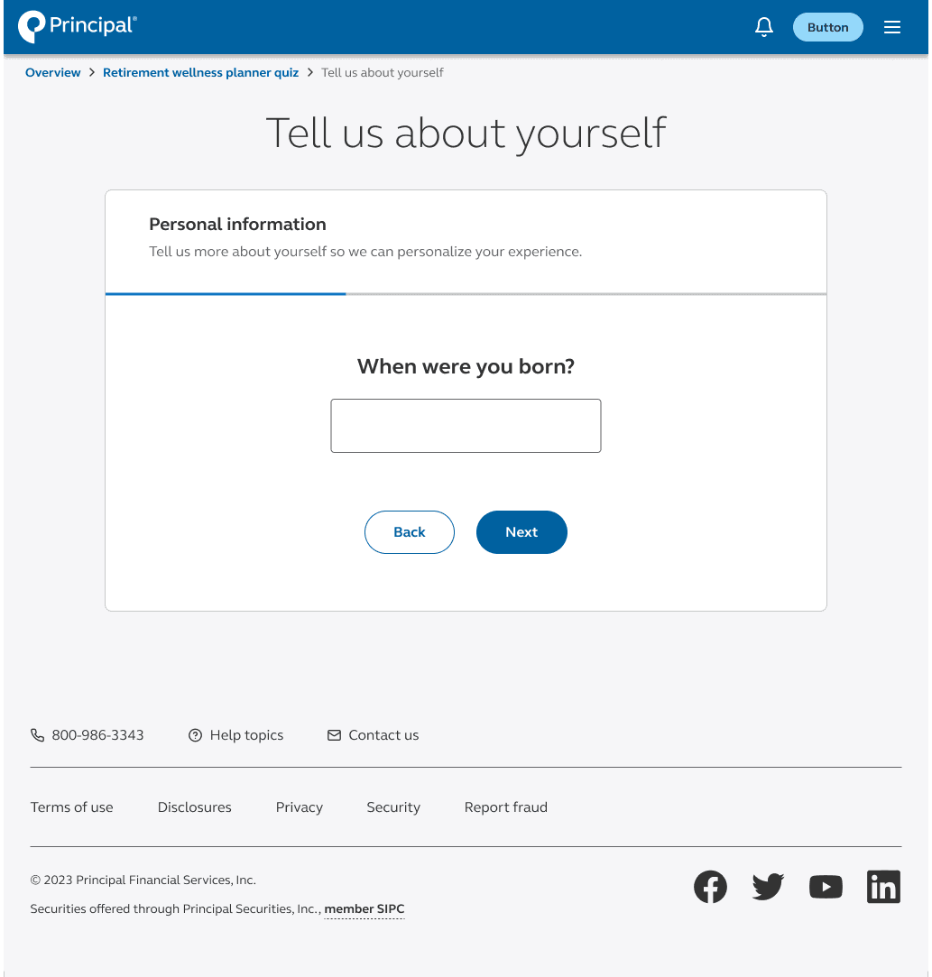
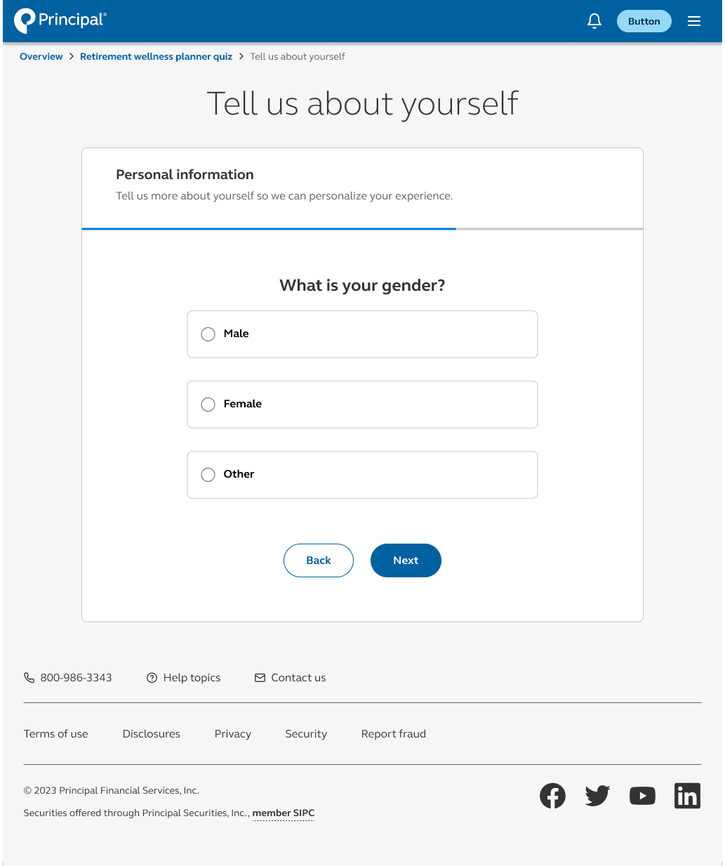
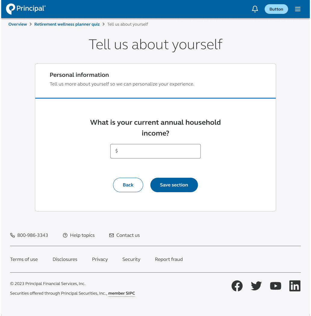
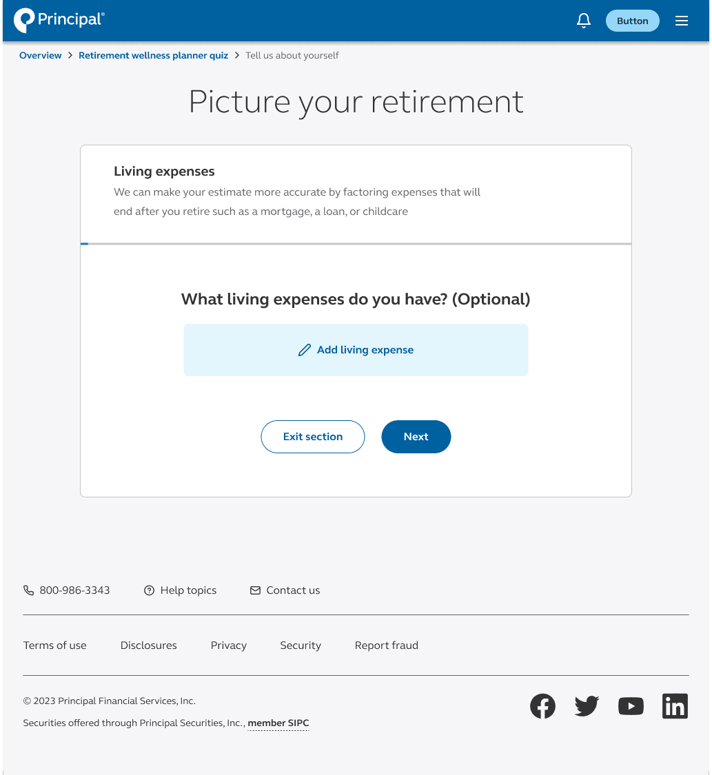
During discovery sprints, we collaboratively outlined the information architecture, identified key data points, and mapped out the user flow. Through focused discussions, we pinpointed critical questions that were instrumental in shaping the foundation of the retirement wellness planner redesign.
Some questions that we wanted to know were:
How is the questionnaire chunked?
Should customers share a lot or a little information?
How often do they want to see their retirement metric change?
How much time are people willing to spend on the retirement wellness planner?
What is the value of completing this retirement wellness planner?
Would they come back to this?
Competitors analysis
Several companies offer retirement wellness planners or similar tools to help individuals plan for their retirement. In conducting competitive analysis, I have identified common shortcomings among existing retirement planning tools, including a lack of clarity and excessive complexity. Many competitors fail to sufficiently address the diverse financial situations and needs of individual users, leading to frustration and disengagement. Our findings highlight an opportunity to differentiate our product by prioritizing user-friendly design and tailored financial insights. By addressing these pain points directly, we aim to empower users to take proactive steps towards their retirement goals with confidence.
First iteration

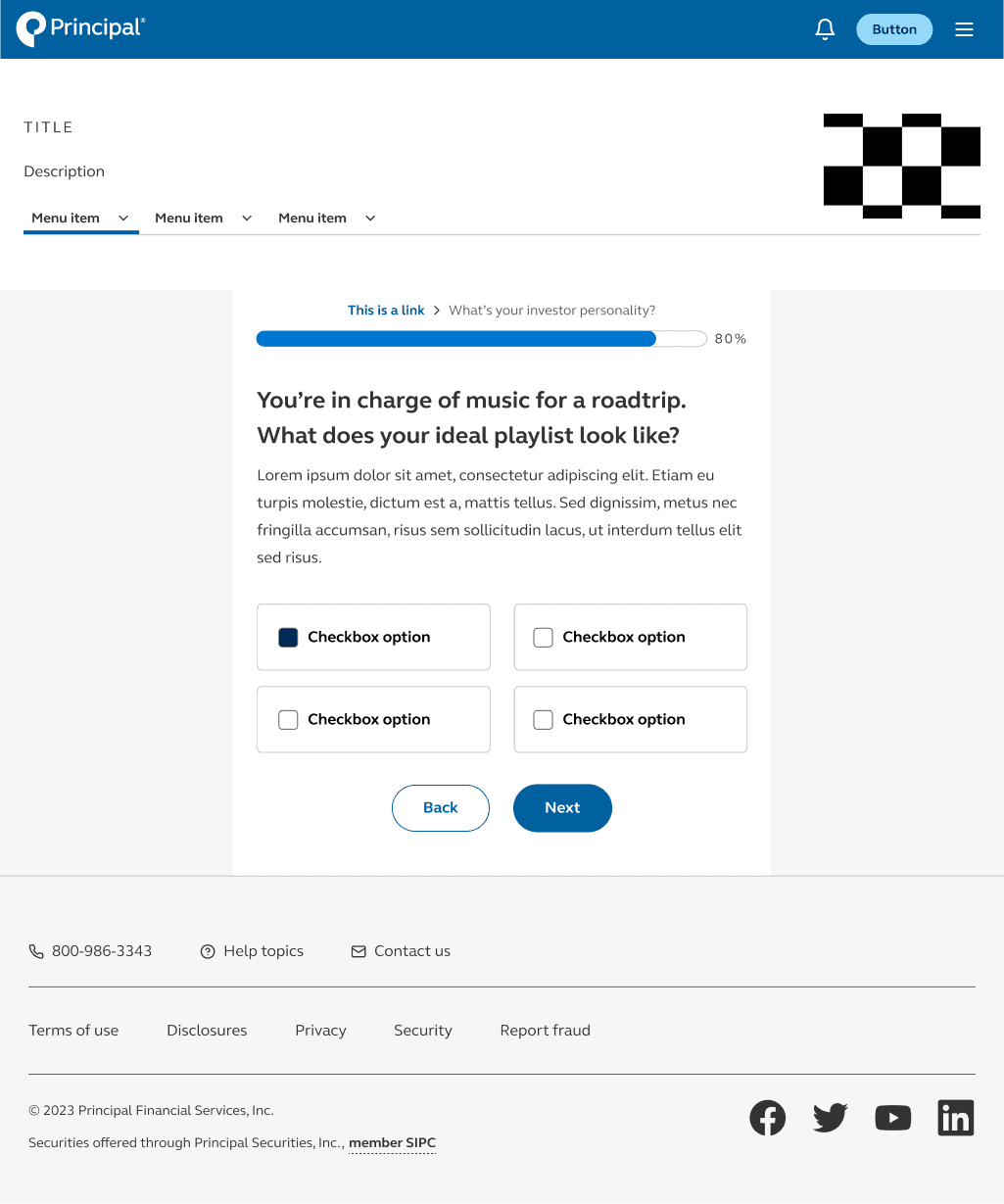
In the initial iterations of our designs, we aimed to incorporate a multitude of ideas and concepts, resulting in a form designed to accommodate various types of questions. Customer feedback had not been integrated into these designs, and we made the decision to prioritize testing the designs to ensure they align with user preferences and needs.
User testing #1

“I want to be able to complete the assessment in a simple, straightforward way so I can see how my choices connect to my retirement plan and goals”
“When I check-in on my retirement account, I want to easily see if I’m on track to reach my retirement goal, so I have a clear understanding of where I stand”
Second iteration

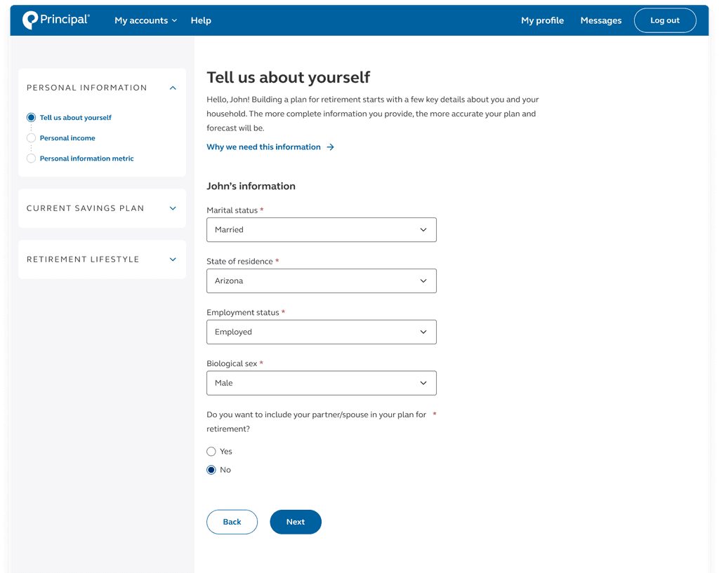
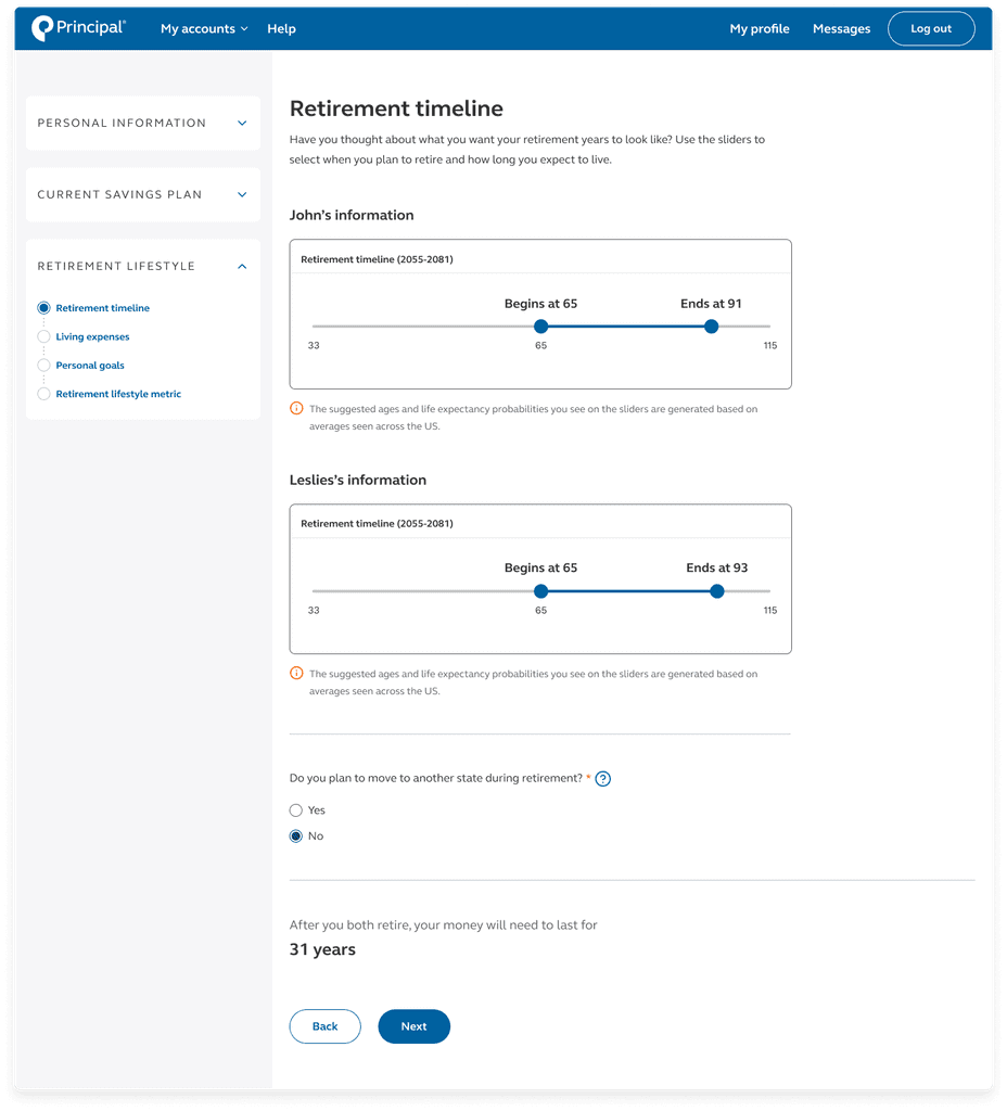
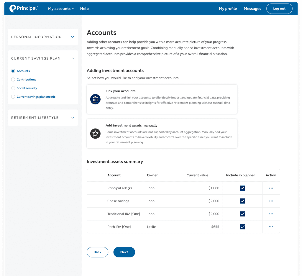
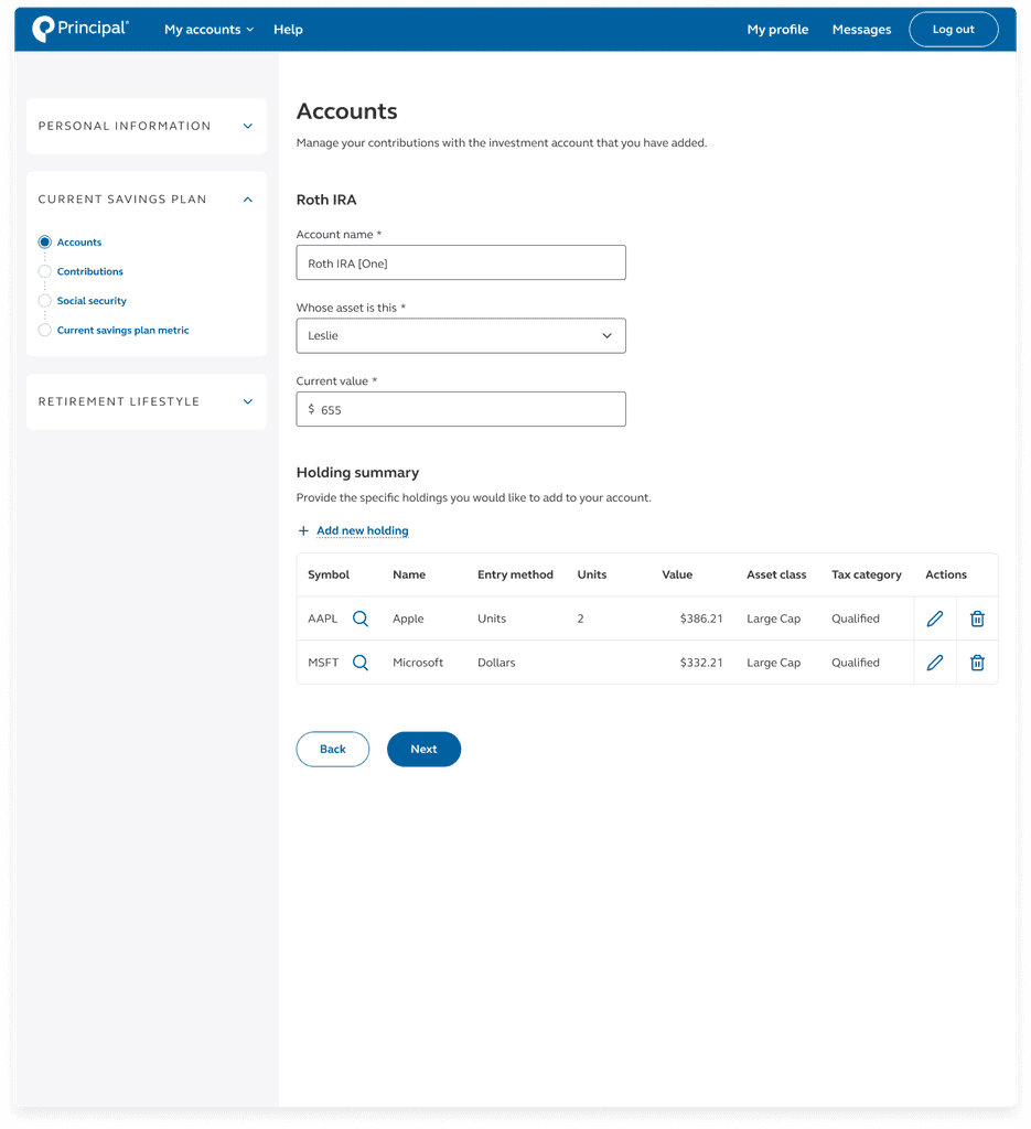
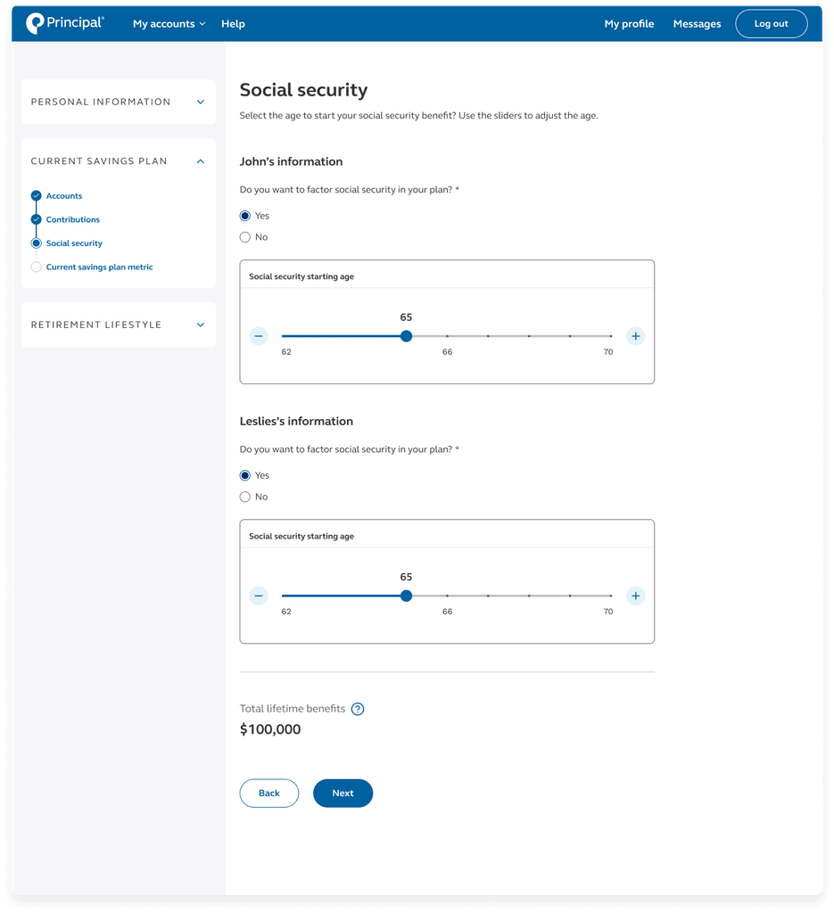
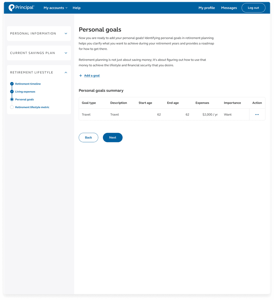
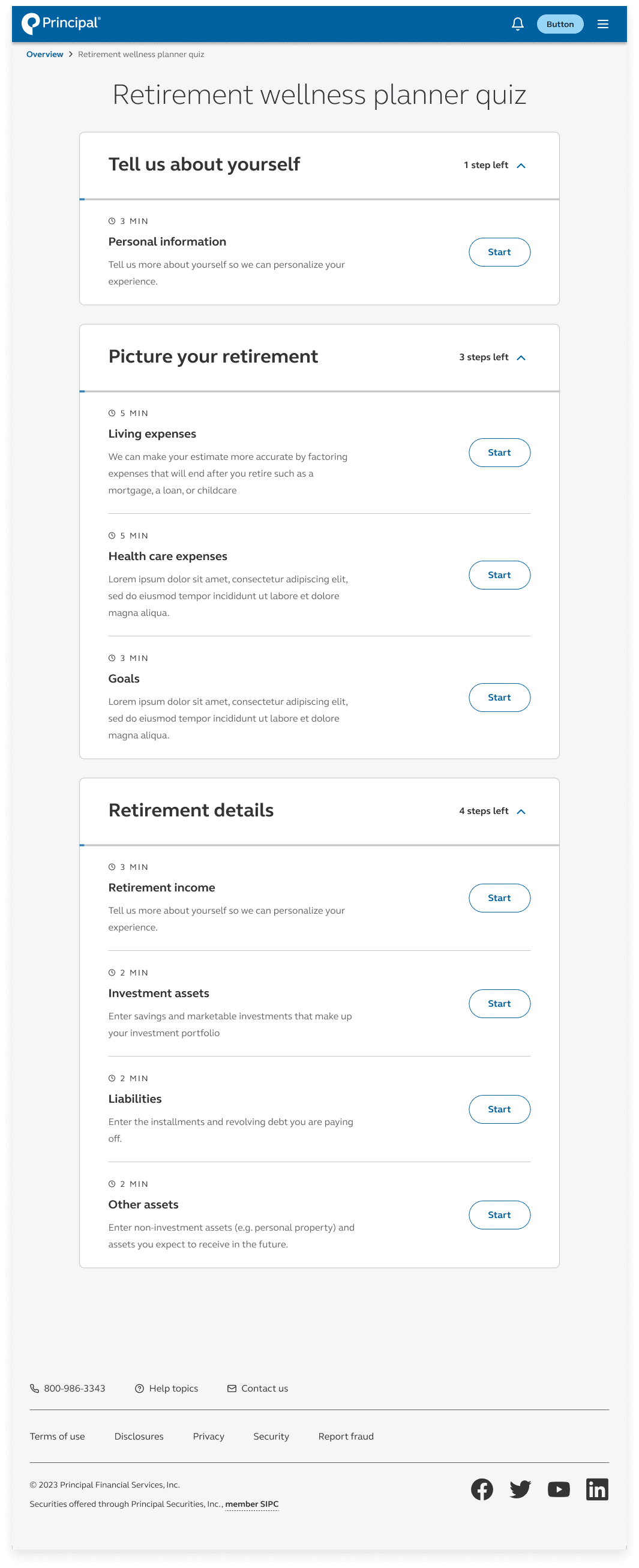
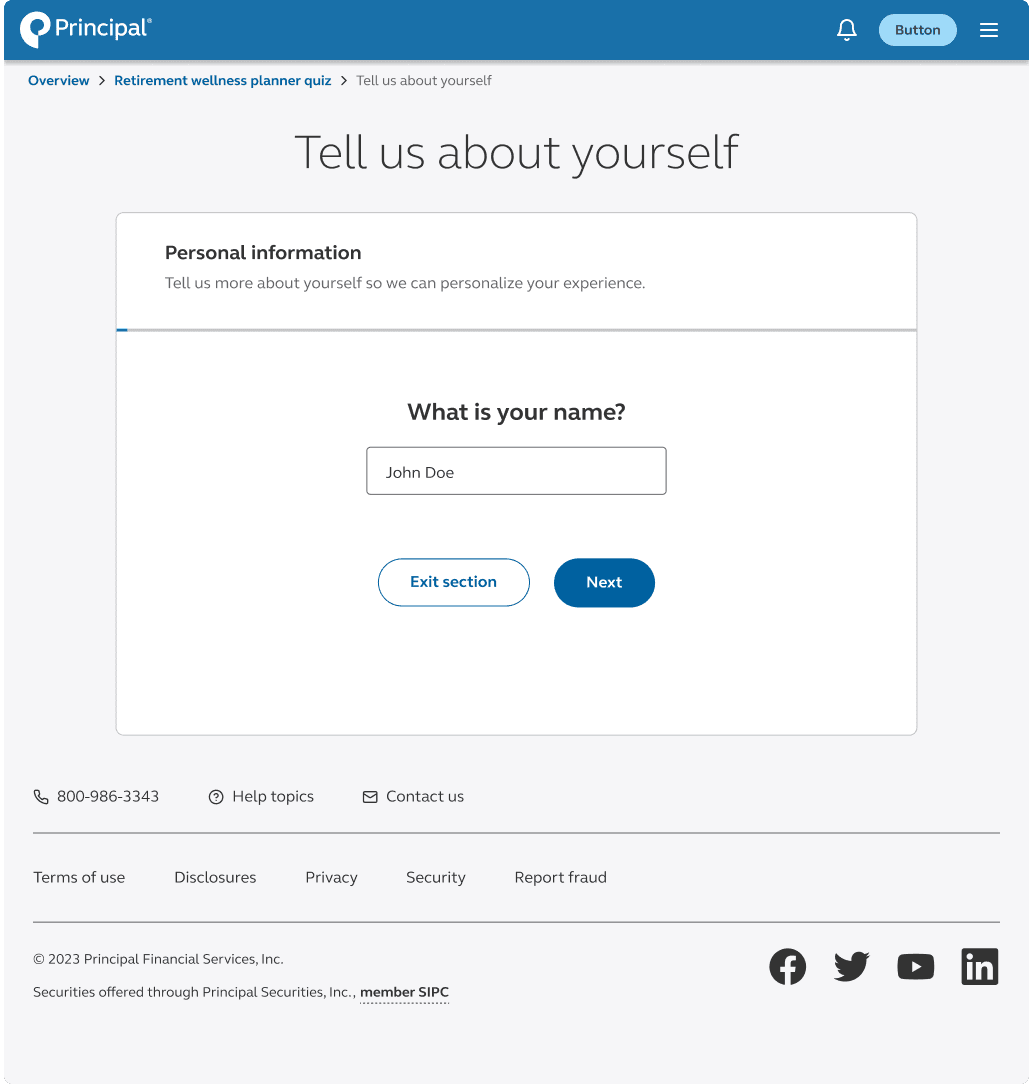
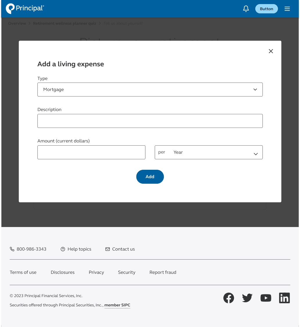
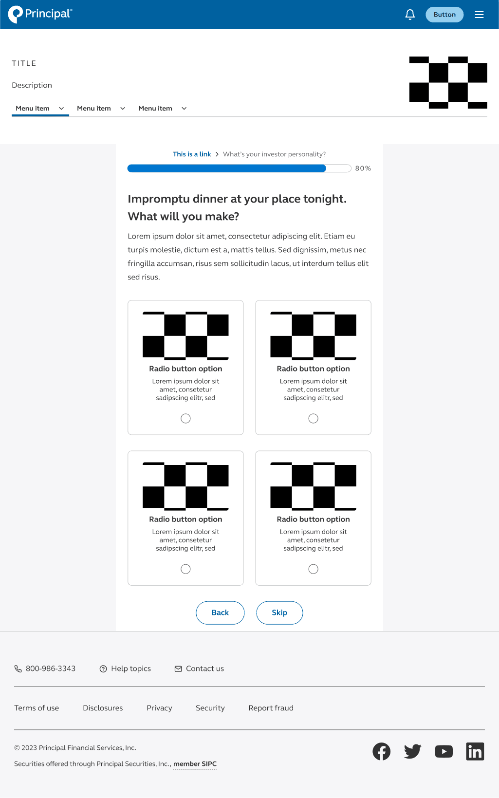
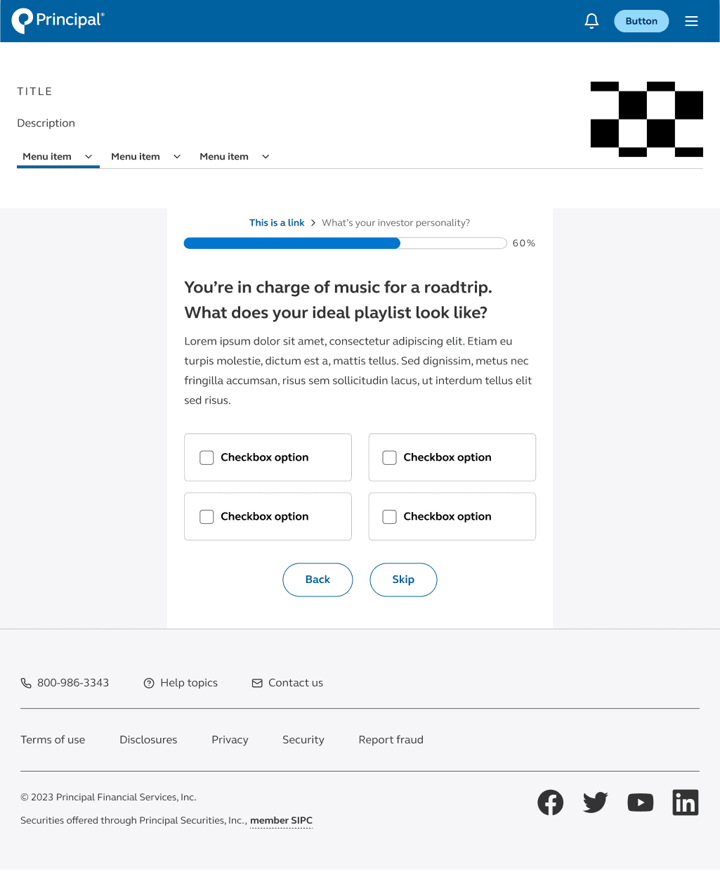
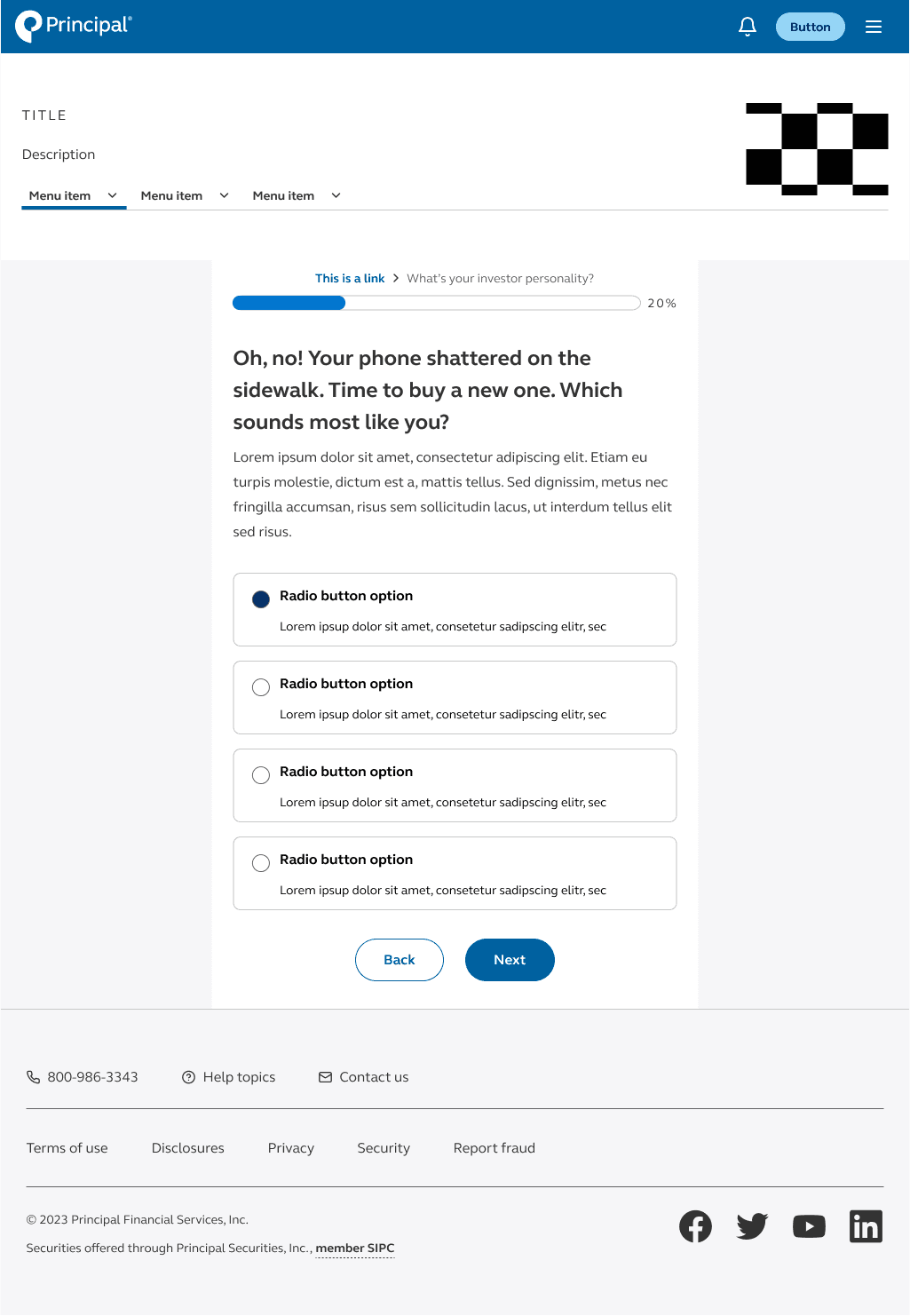
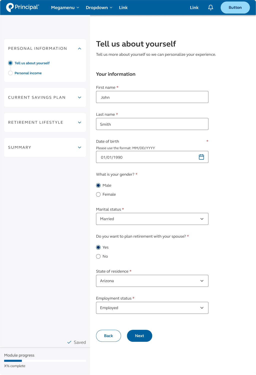
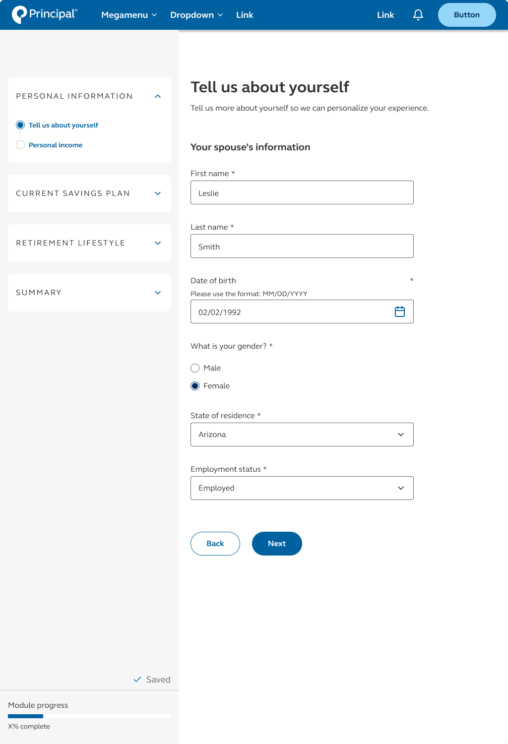
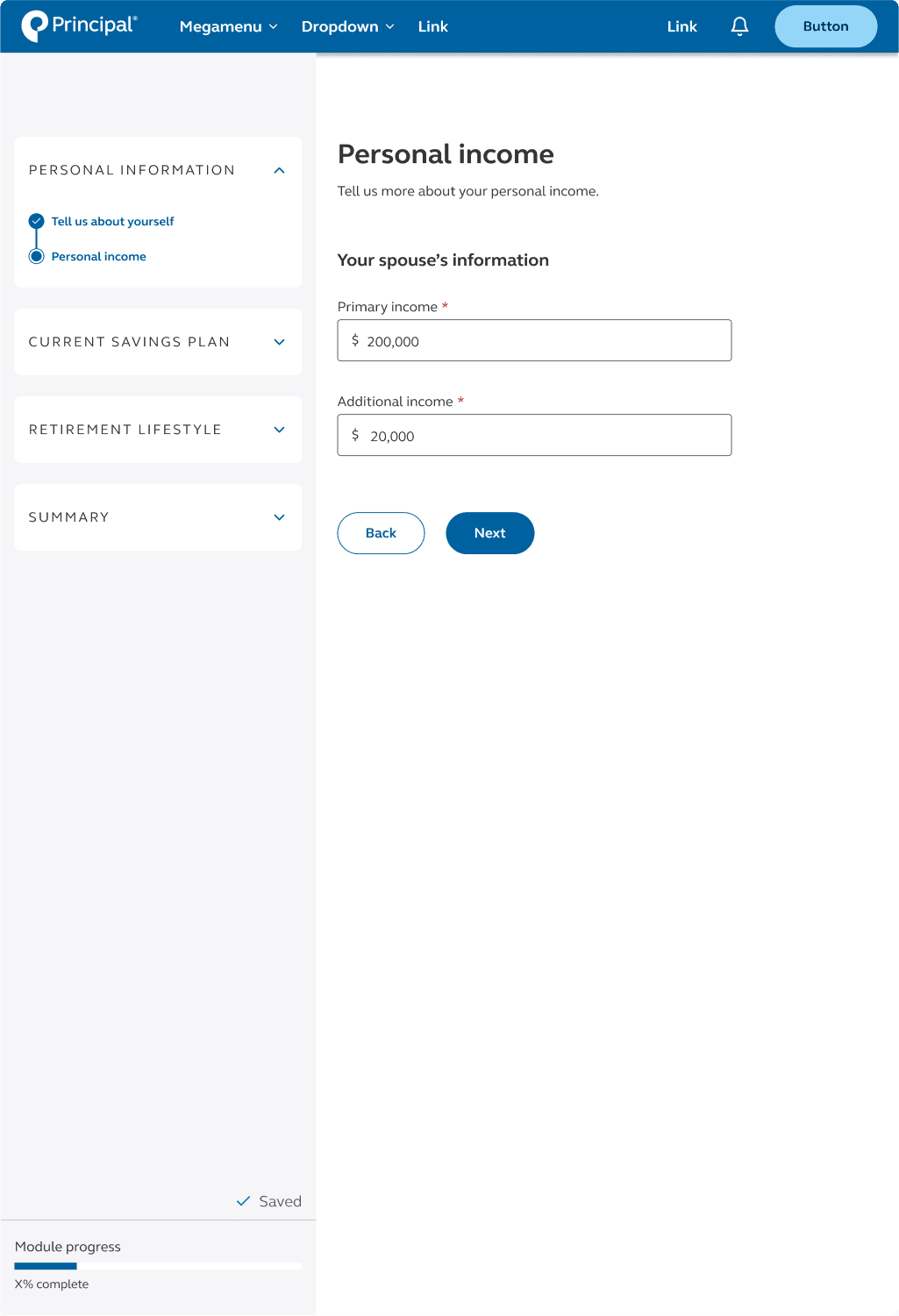
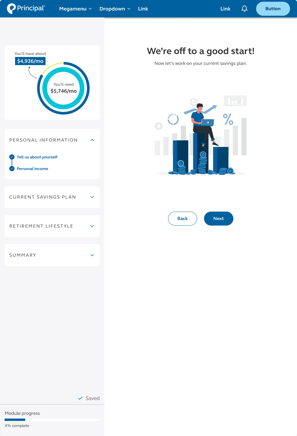
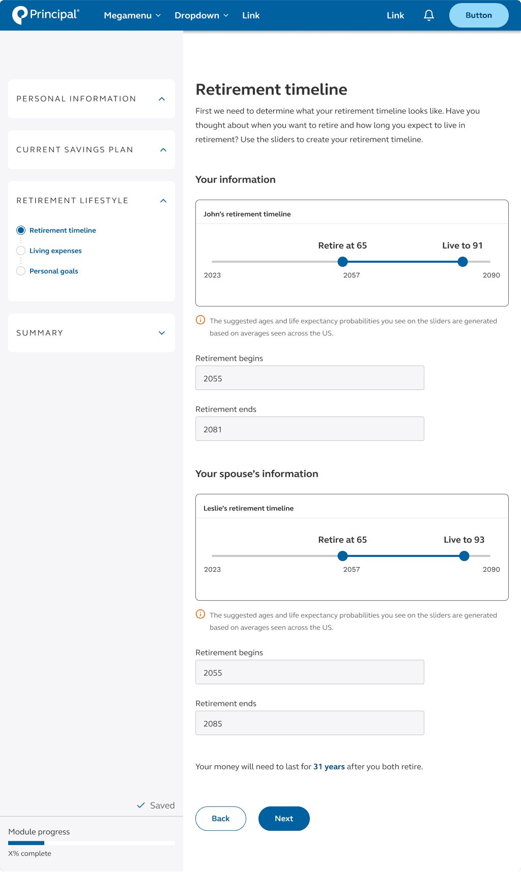
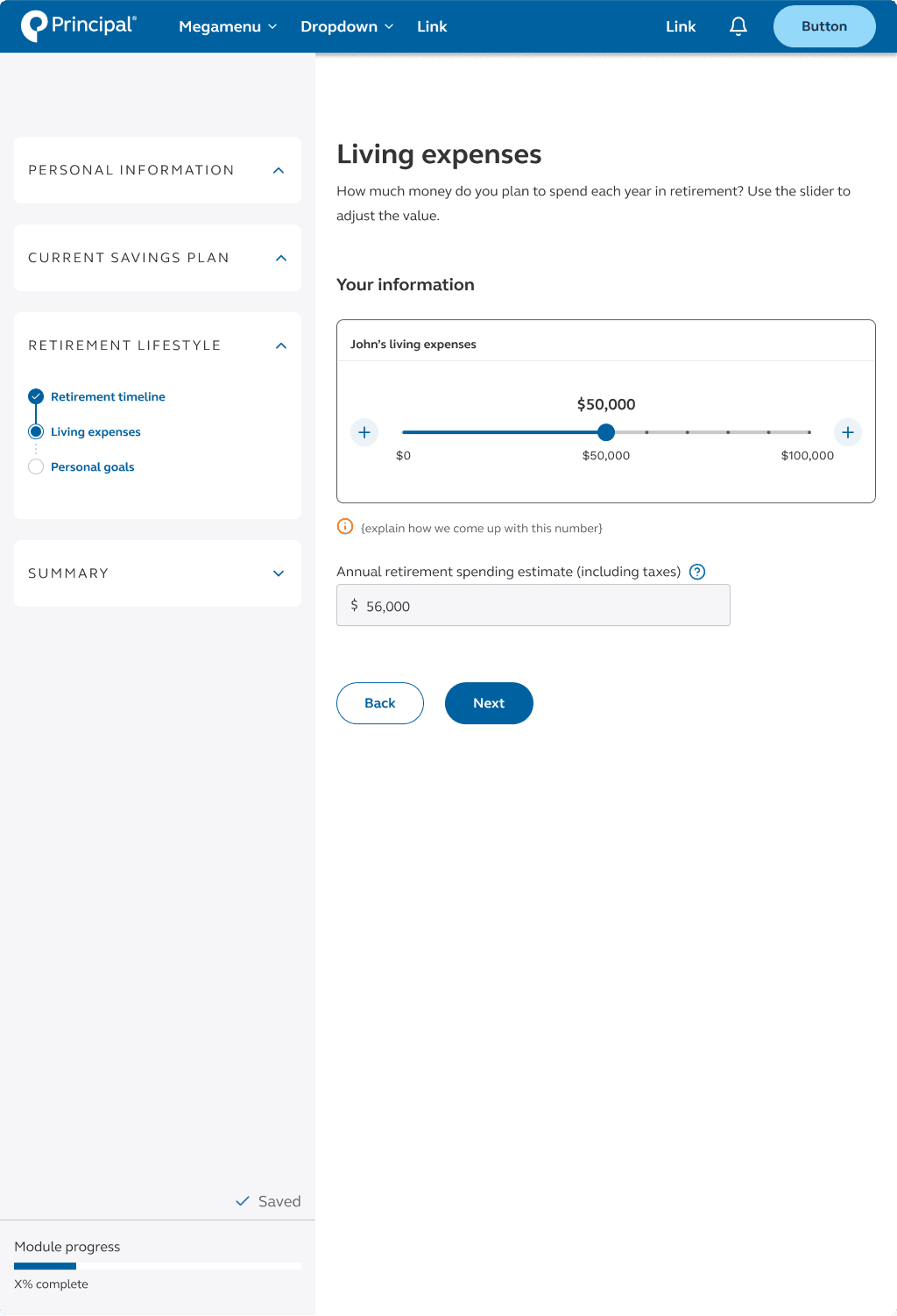
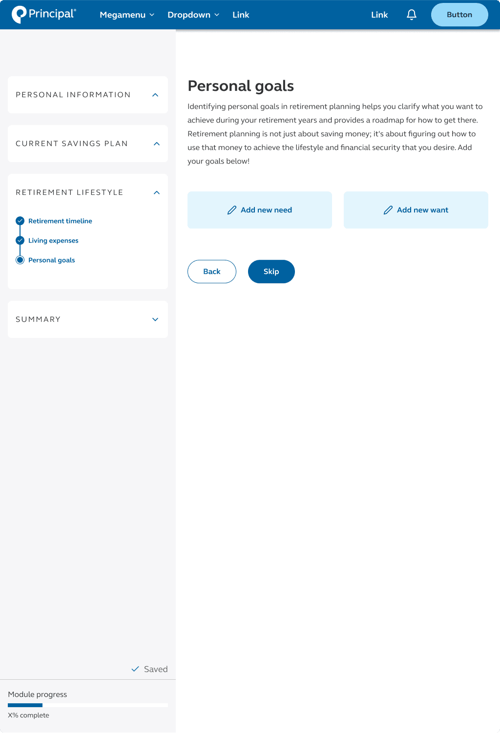
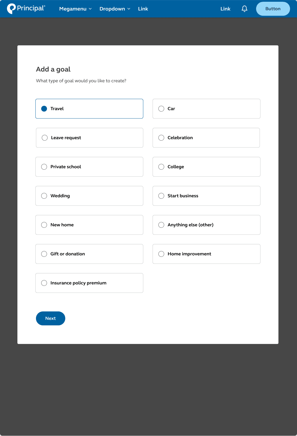
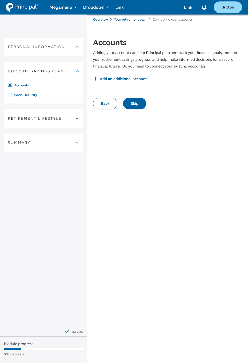
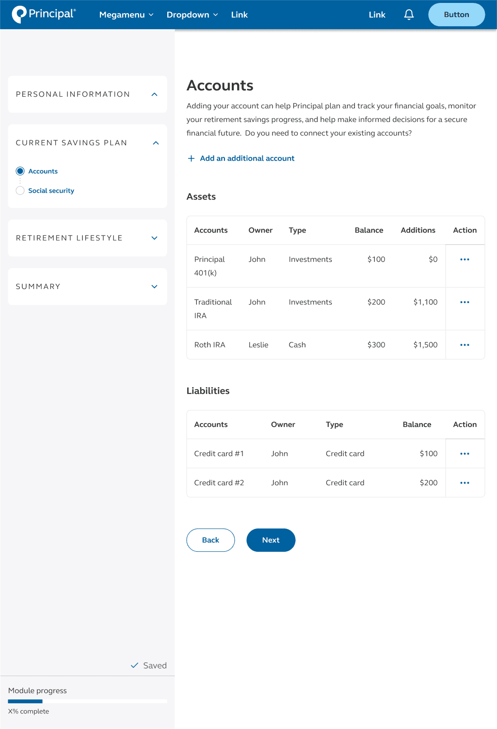
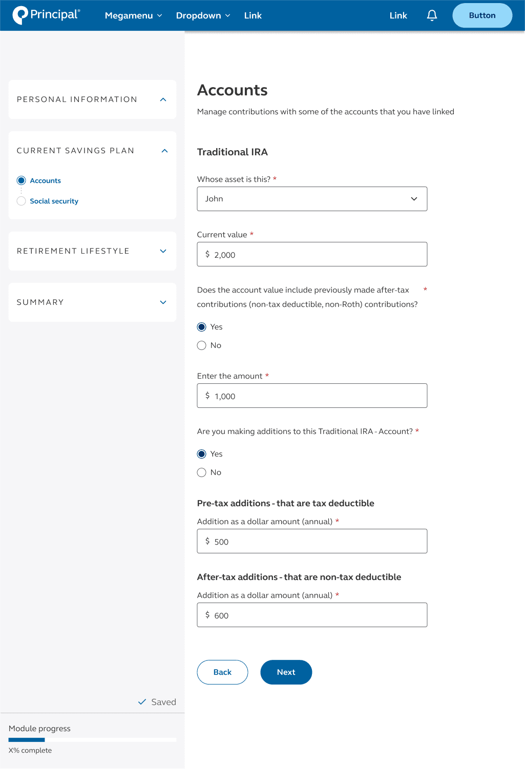
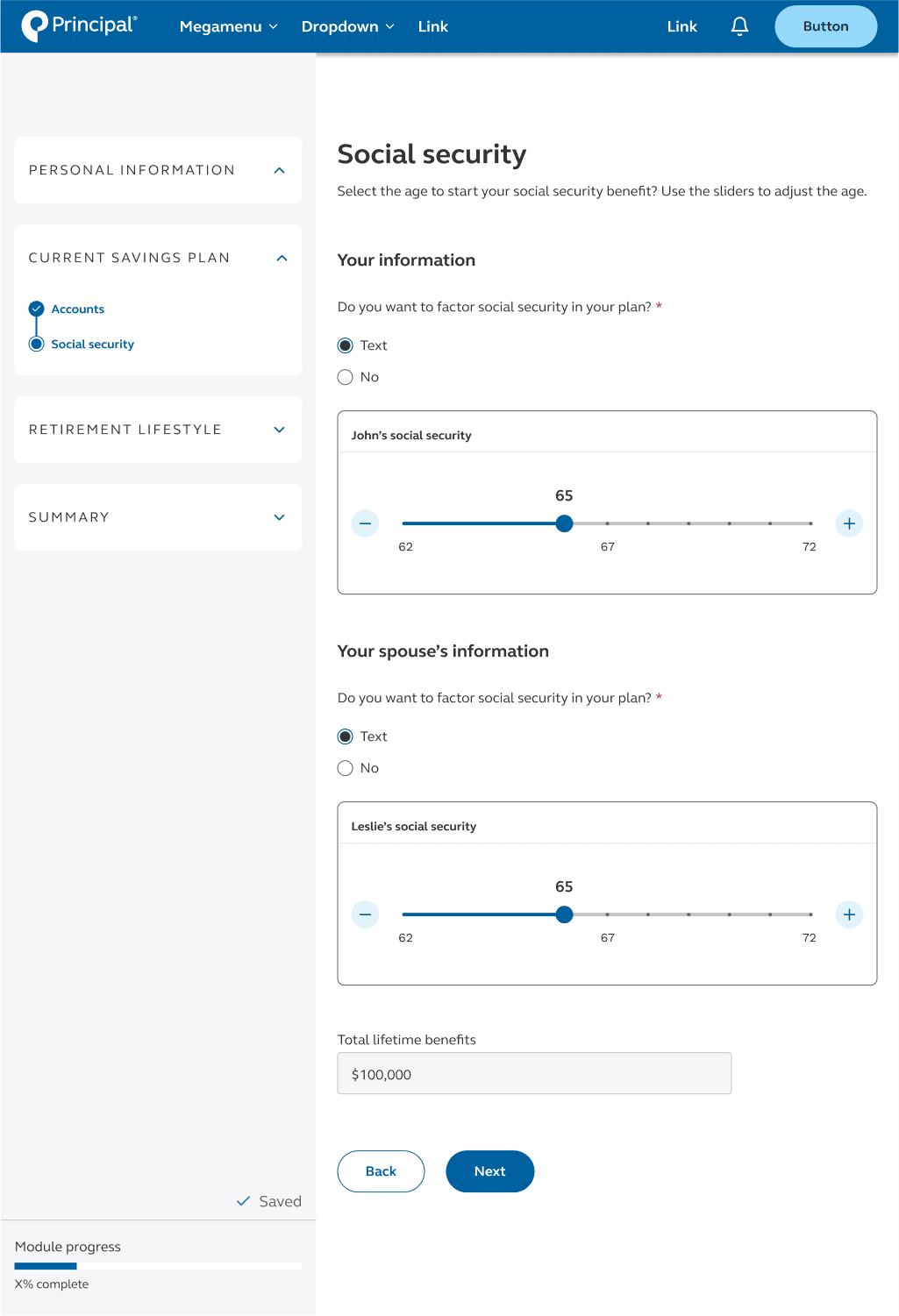
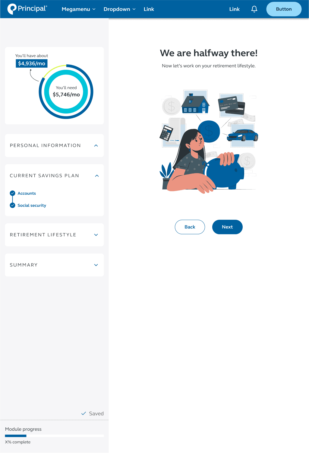
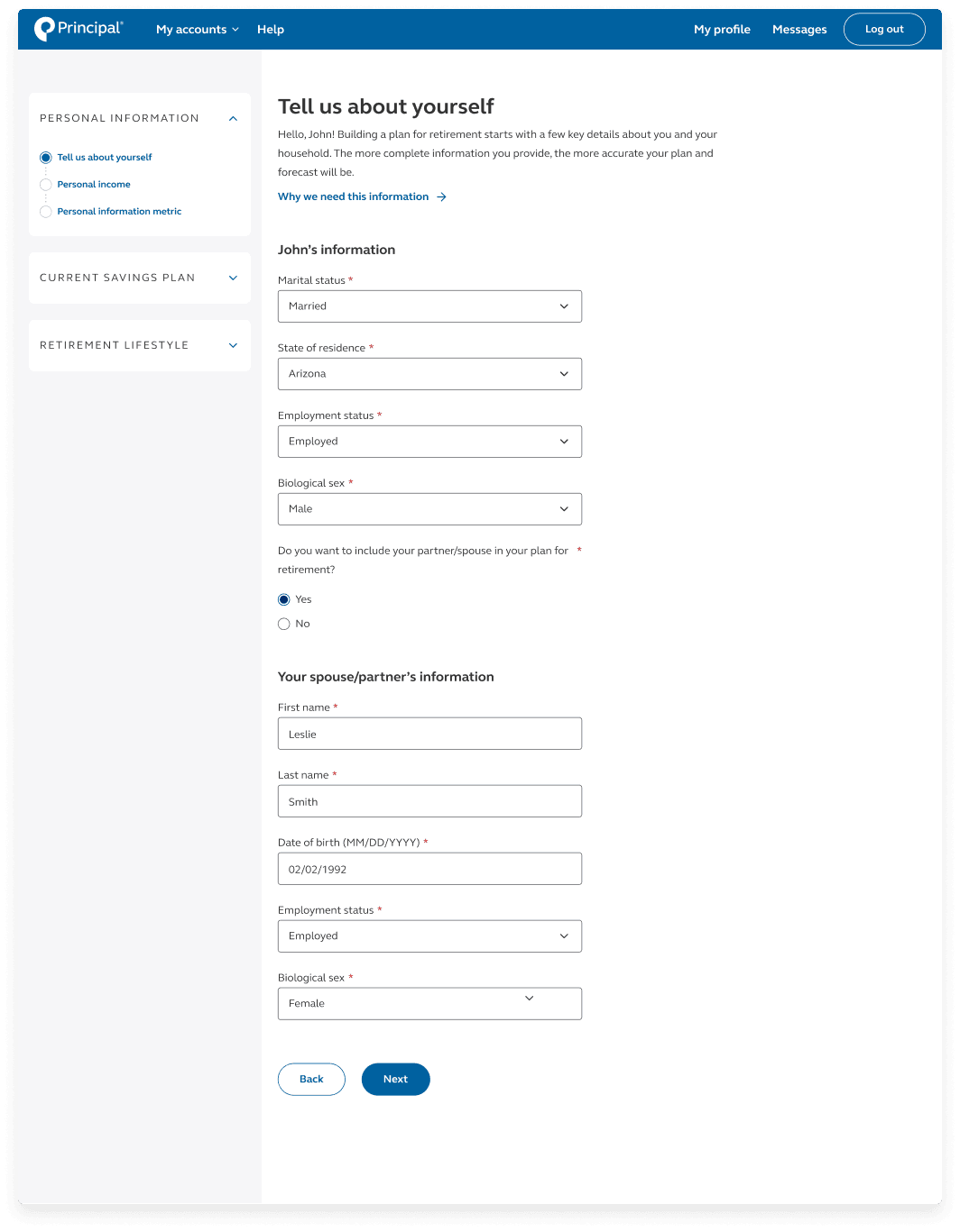
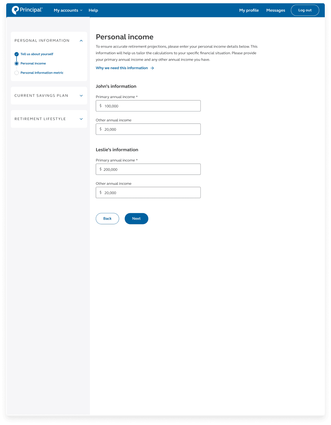
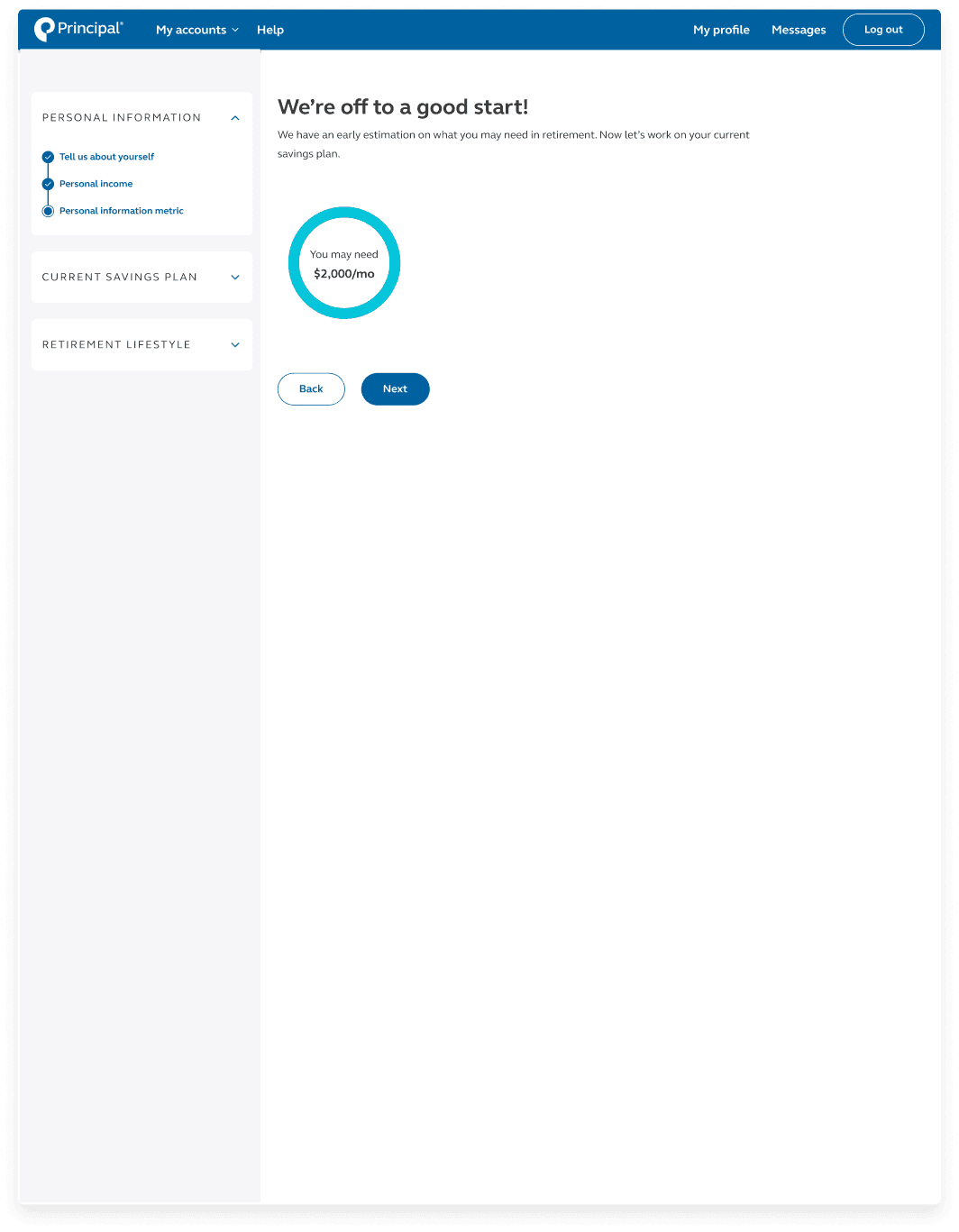
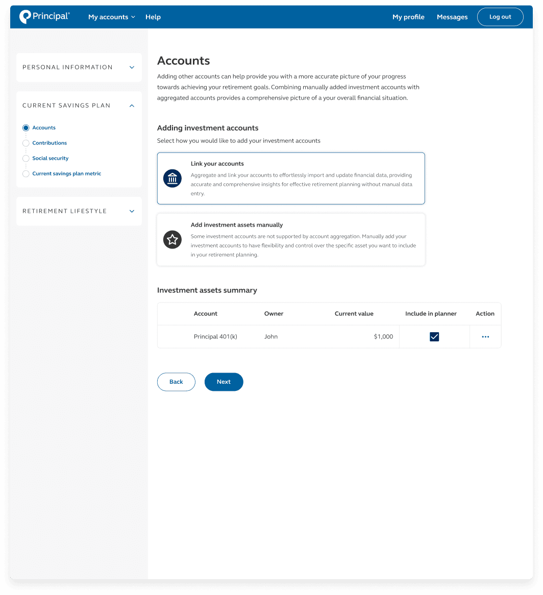
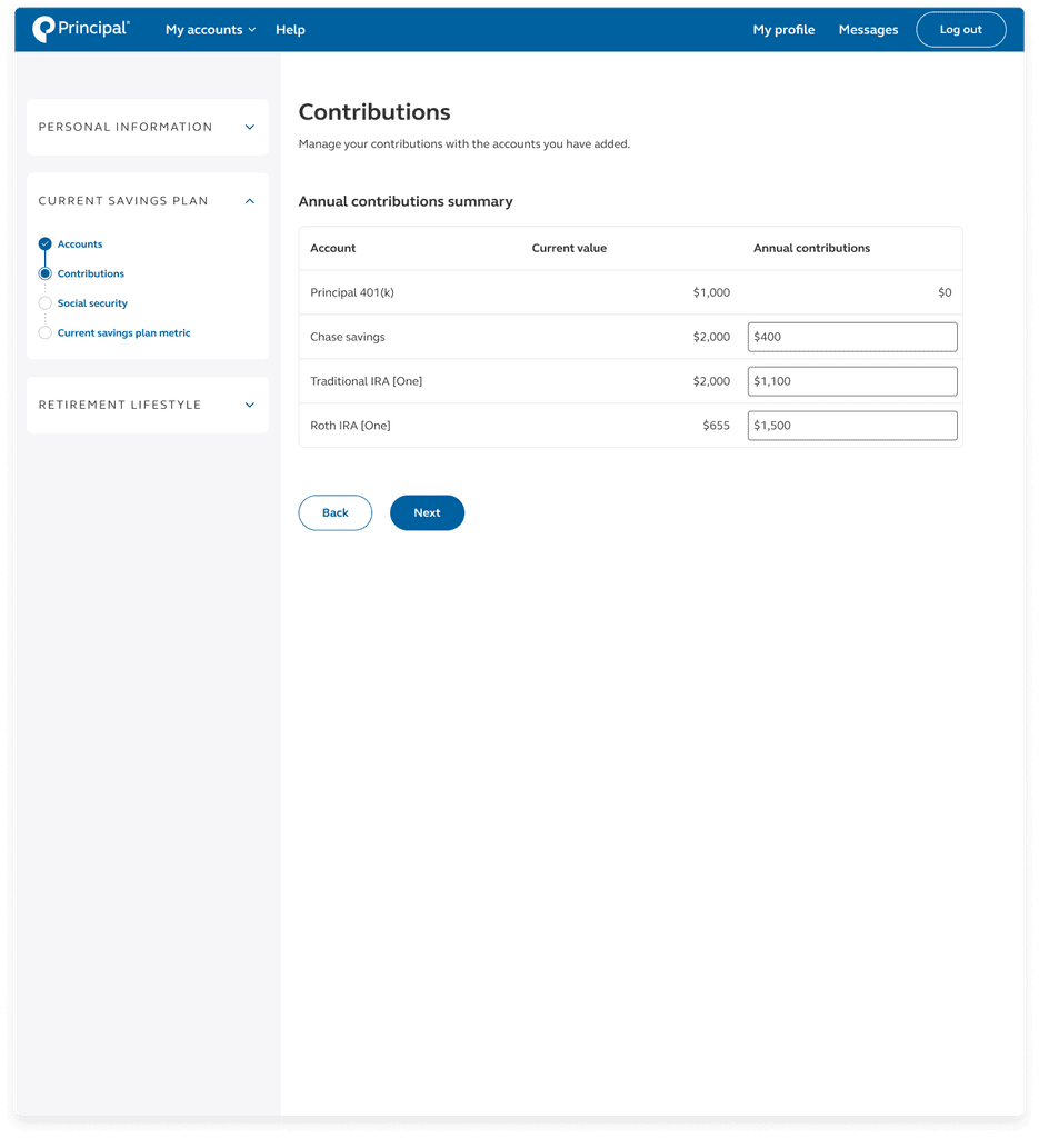
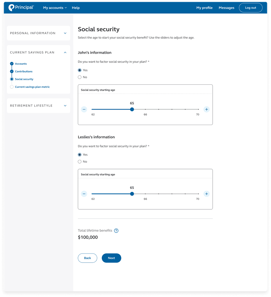
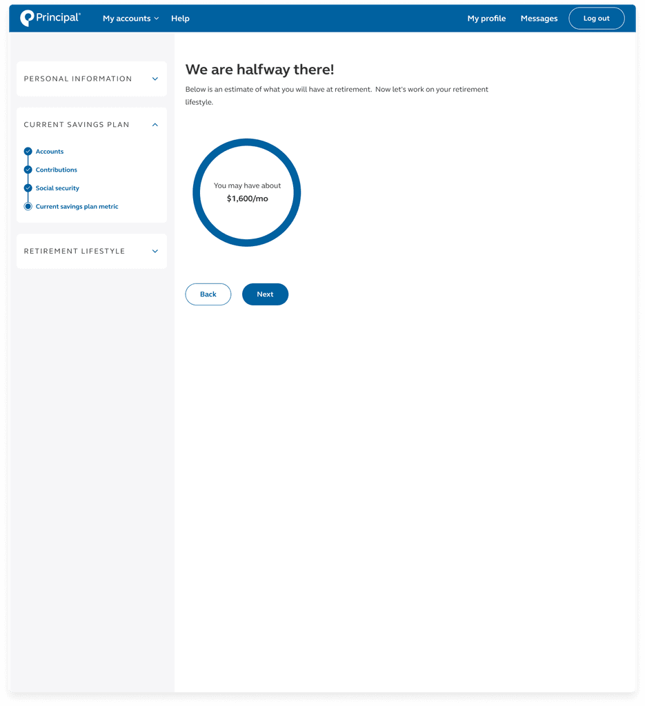
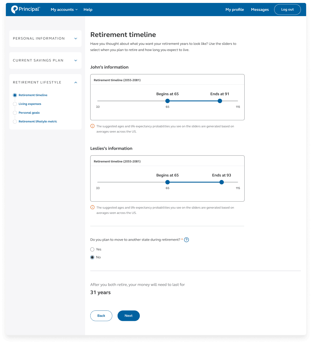
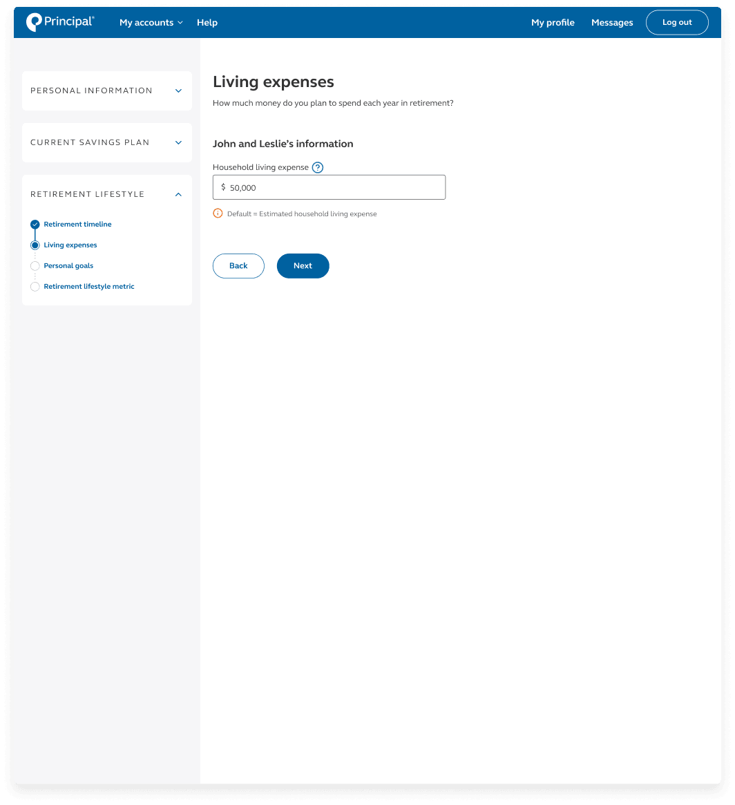
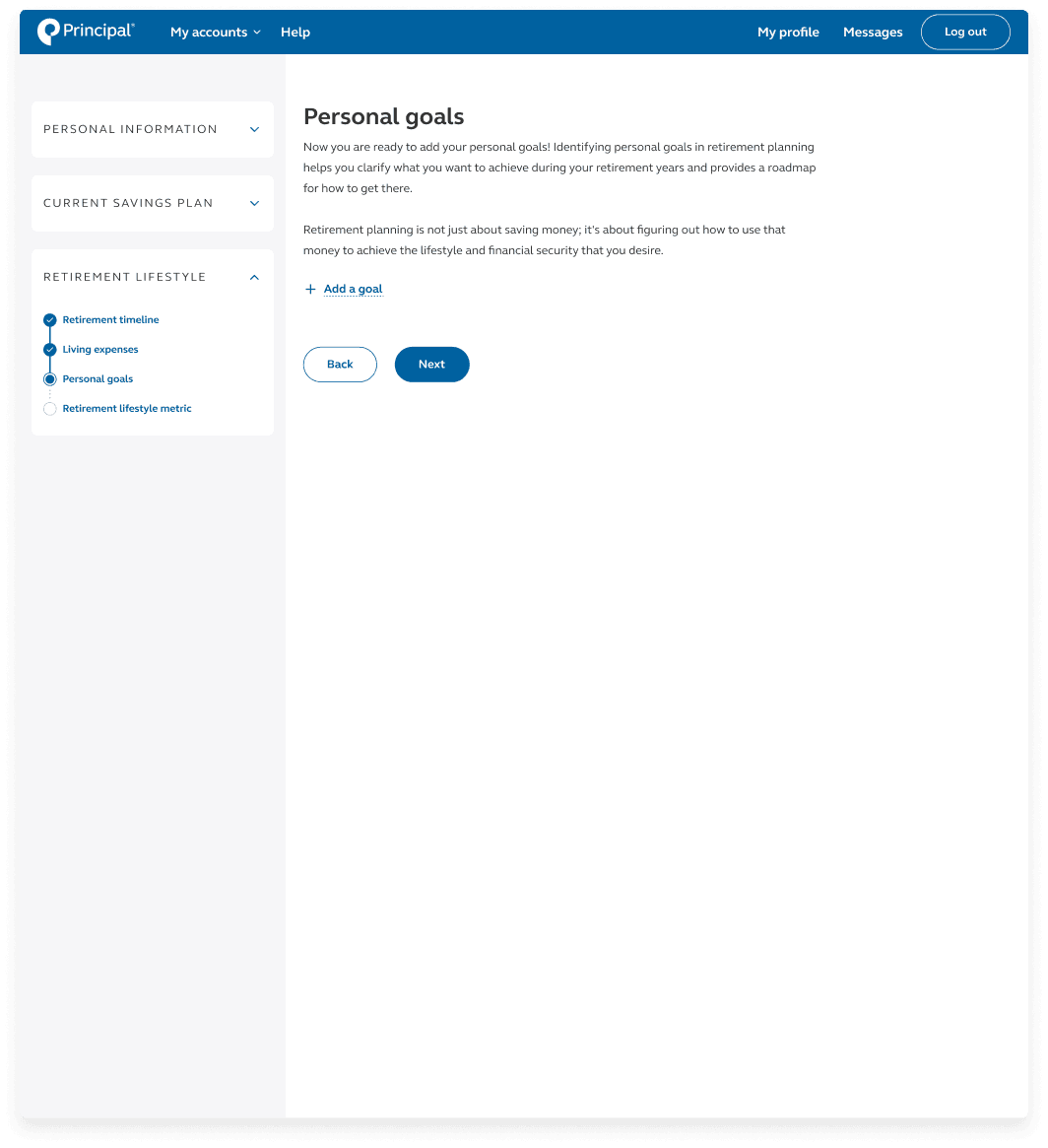
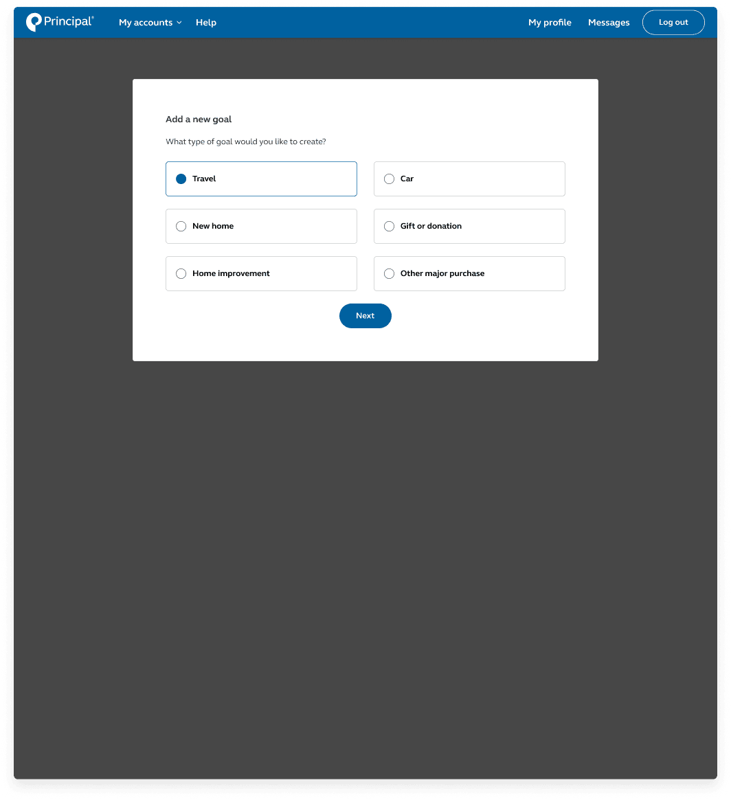
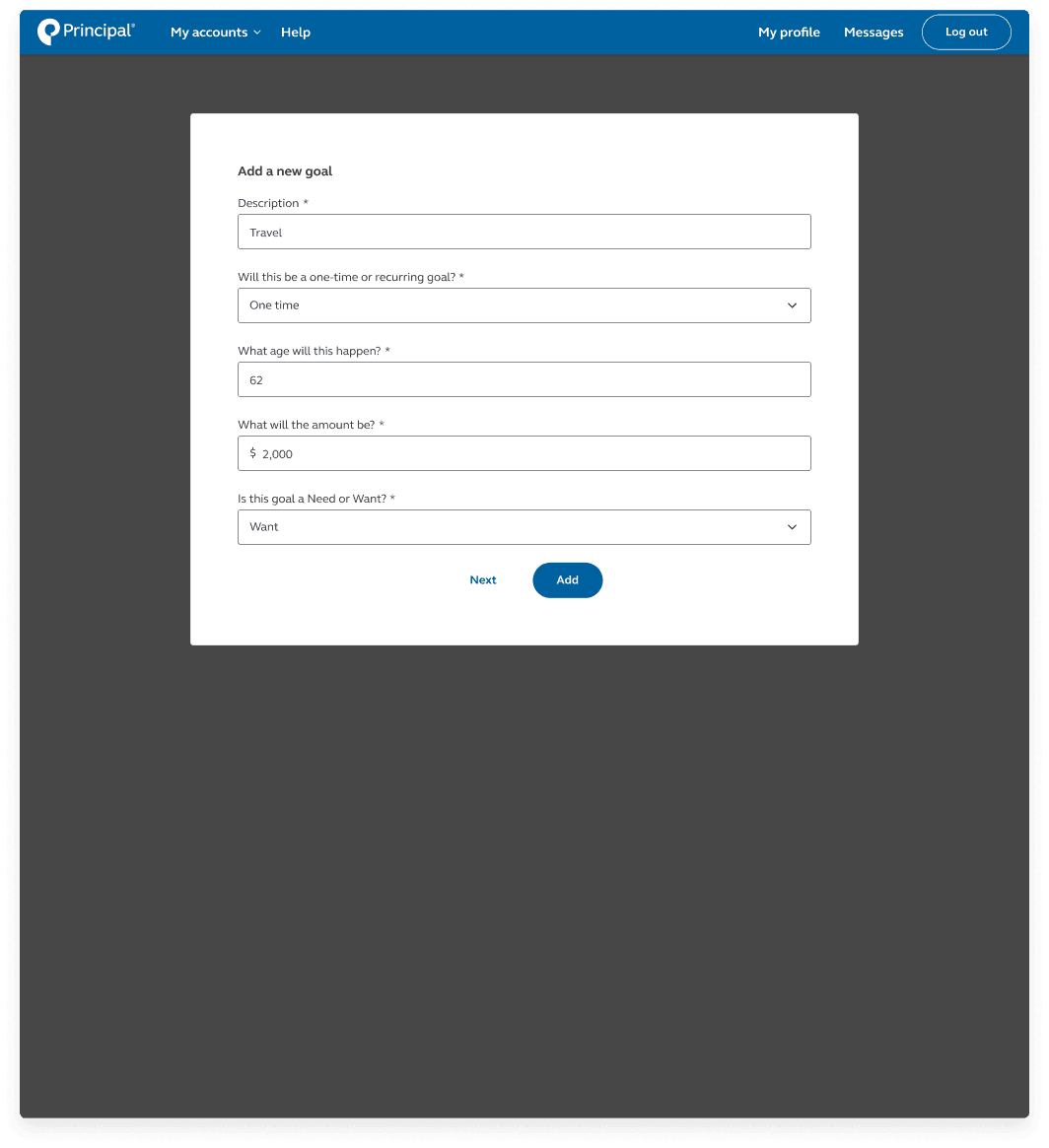
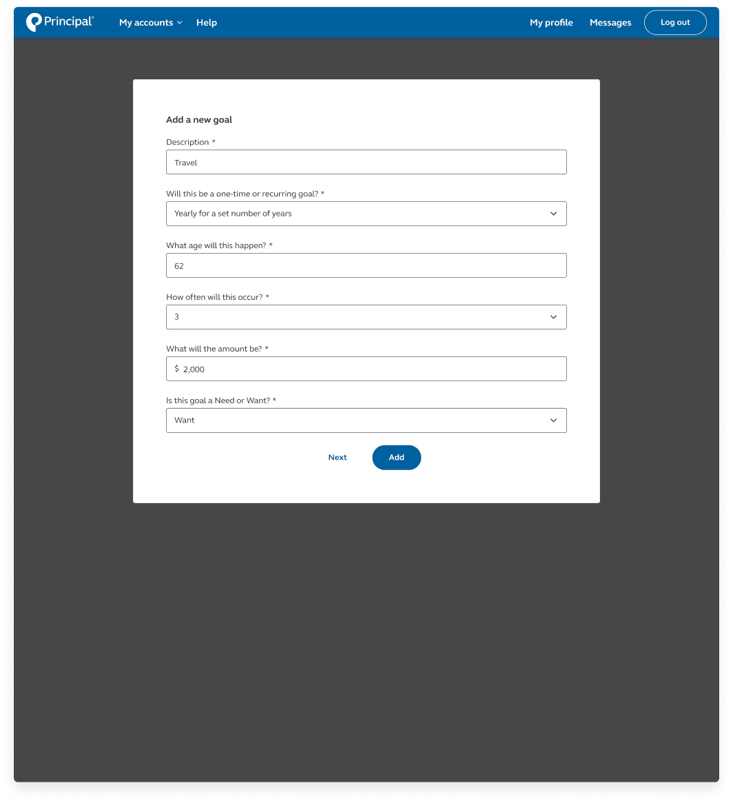
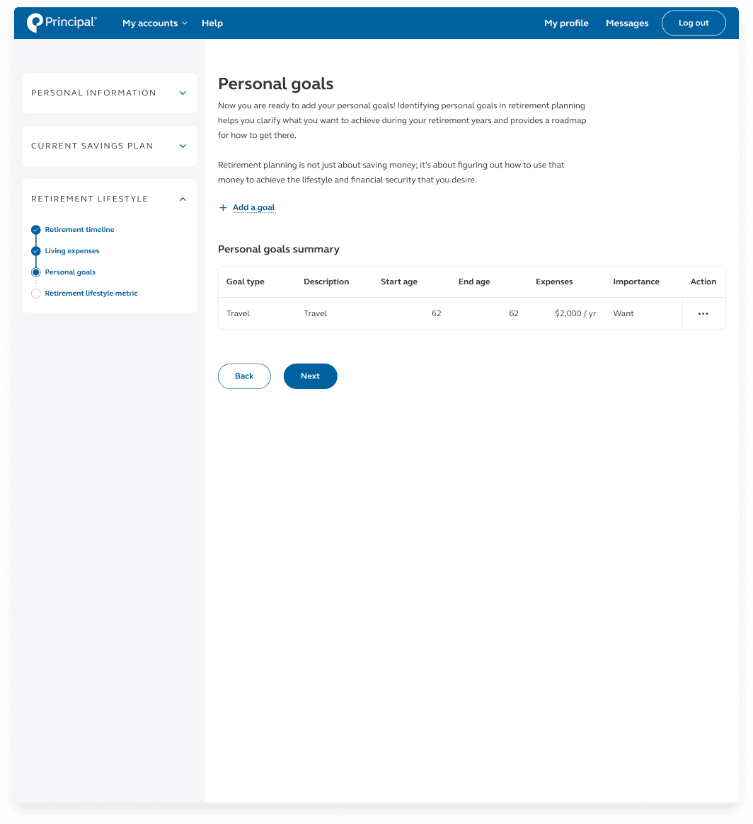
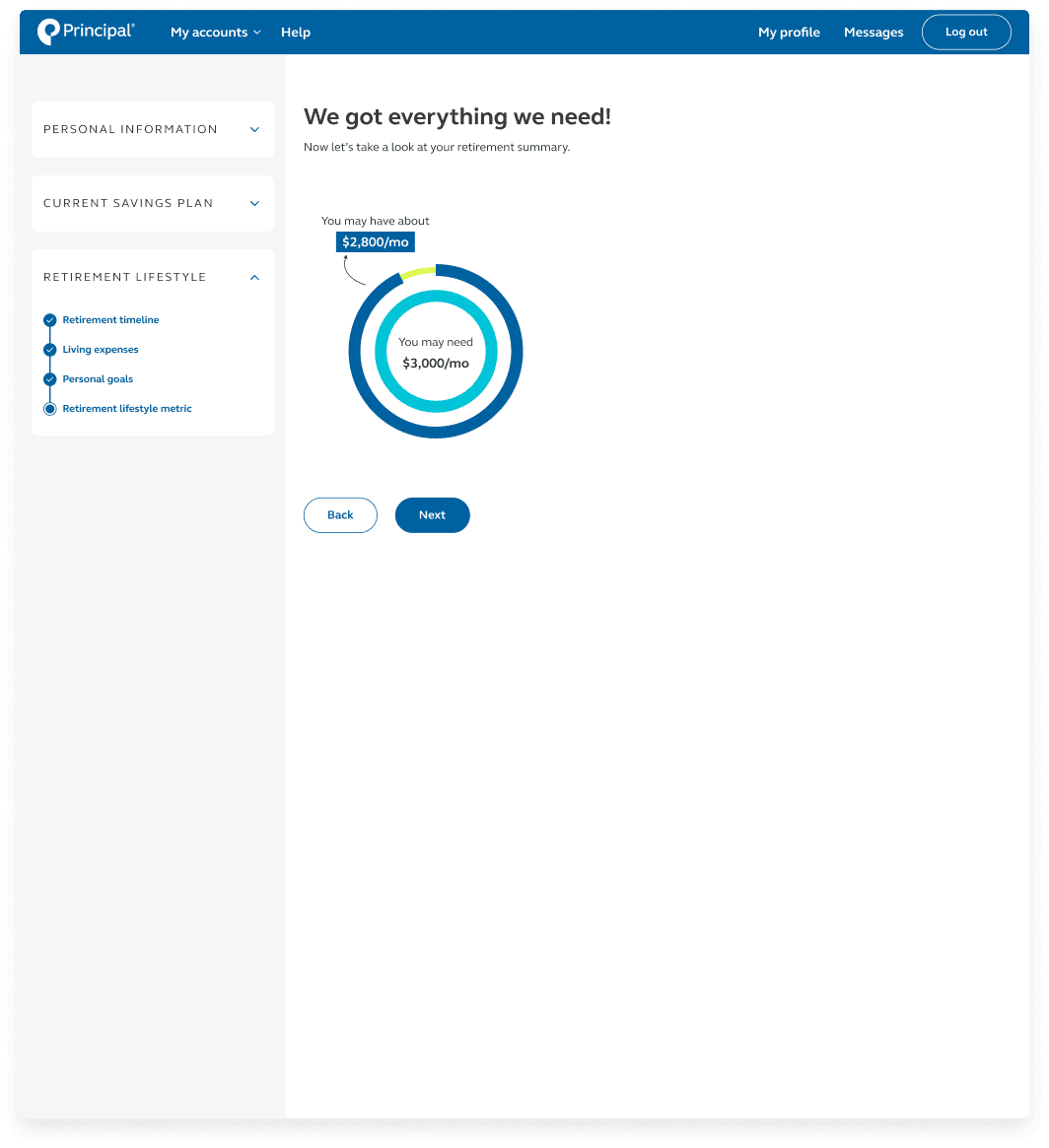
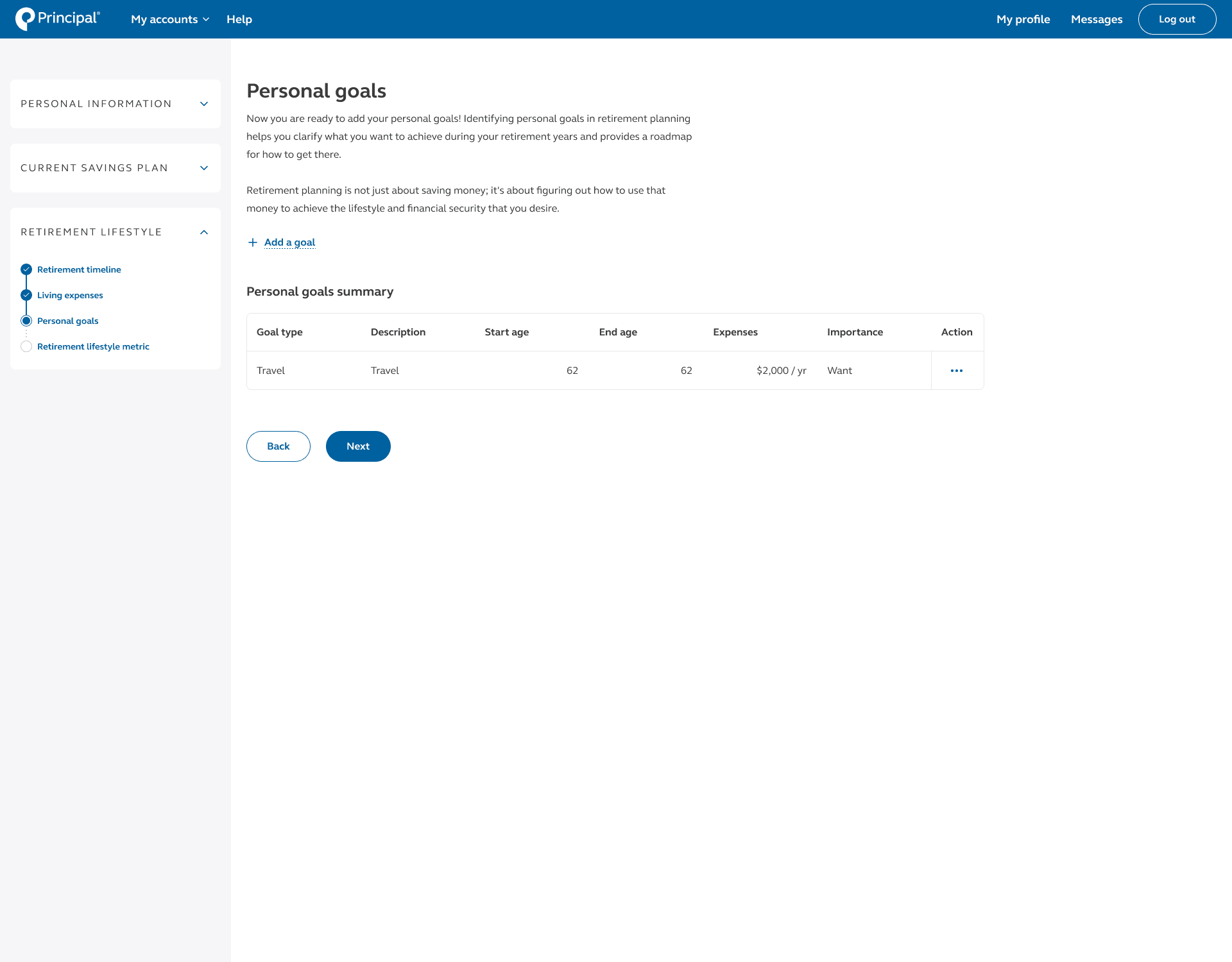
After learning how our customers were setting and tracking their retirement goals, I brought more attention to how the planner should be structured and organized, as well as carefully selecting questions to be included. The quiz is broken down into three sections — personal information, current savings plan, and retirement lifestyle.
Heuristic analysis

Goal: Identify usability issues within the UI by systematically assessing it against a set of established usability principles or heuristics.
Tool: Figma, Microsoft Teams
Number of users: 3
Metric: Qualitative feedback
This heuristic analysis was conducted with 3 Principal UX designer. This evaluation aims to uncover design flaws, usability problems, and areas for improvement that may hinder users' ability to interact effectively with the product. They are looking specifically for design elements, features, or decisions that violate one of the 10 heuristics.
Some of the improvements made to align the work to the 10 heuristics are:
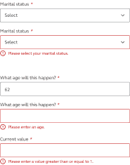
Form validation (Error prevention)
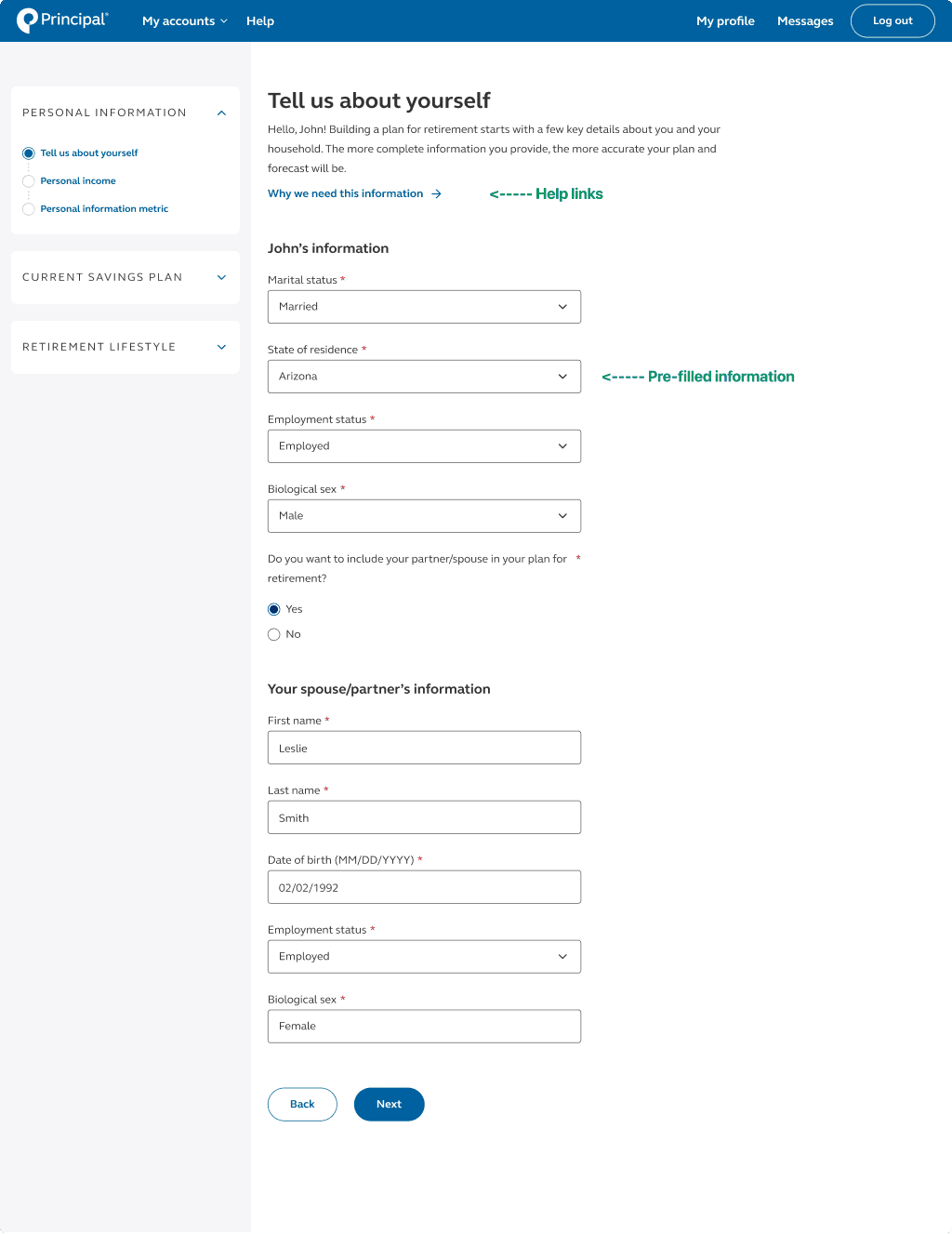
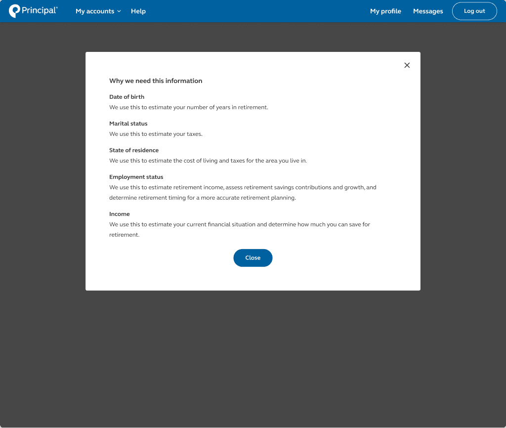
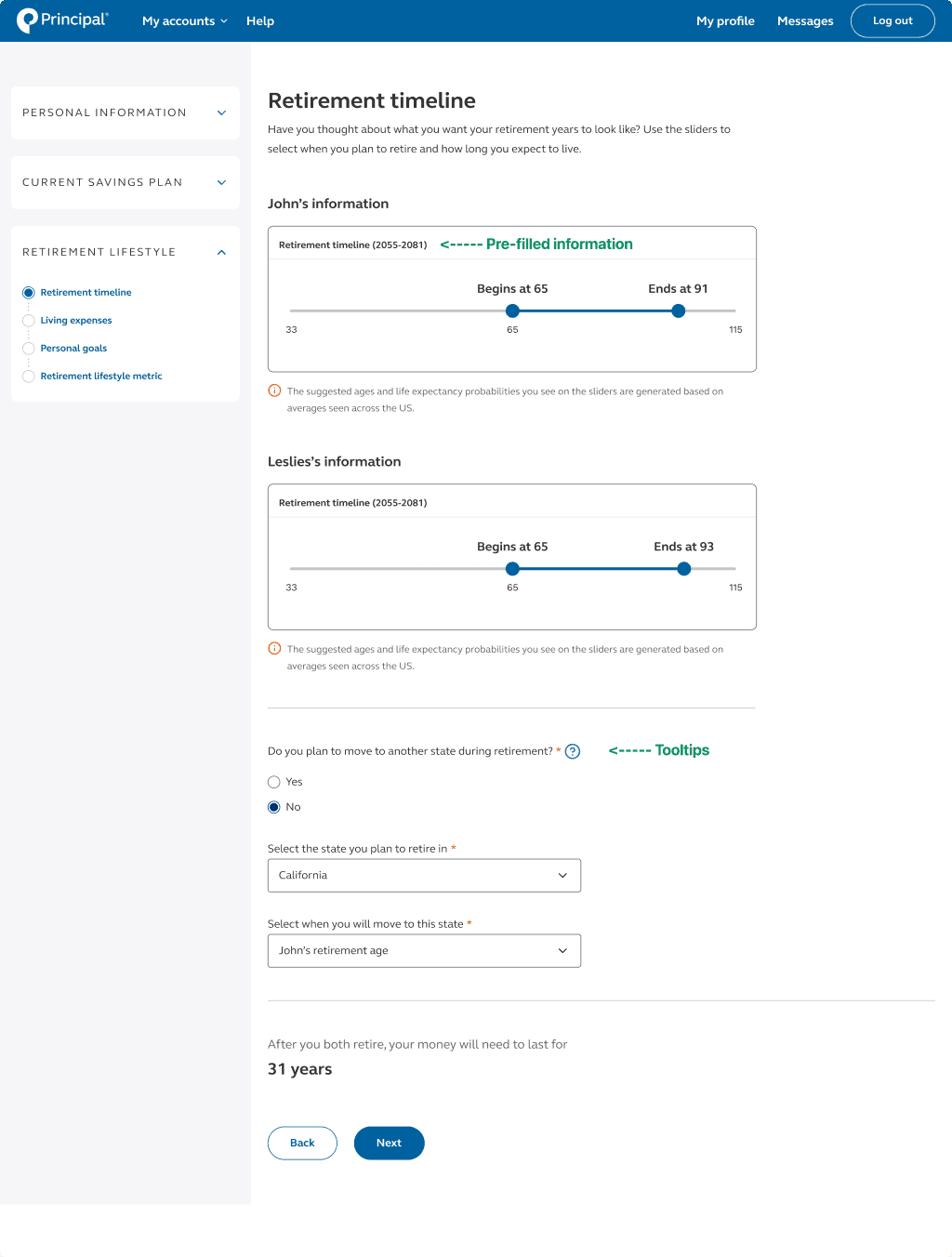
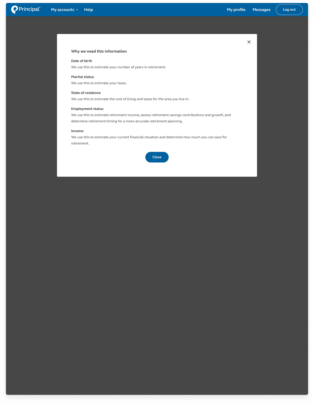
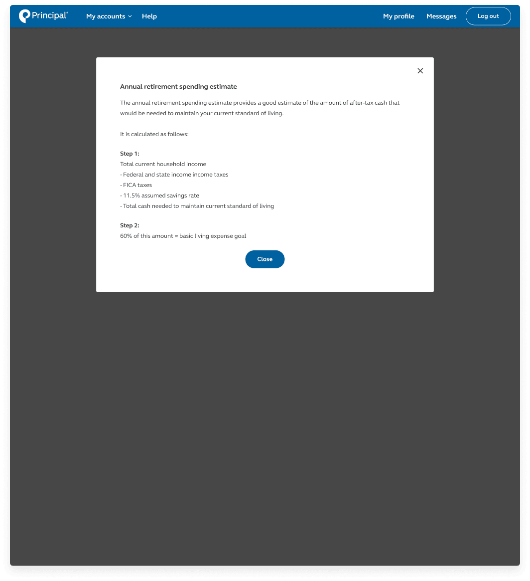
Tooltips / help links (Help and Documentation)
Additional context about section (Help and Documentation)
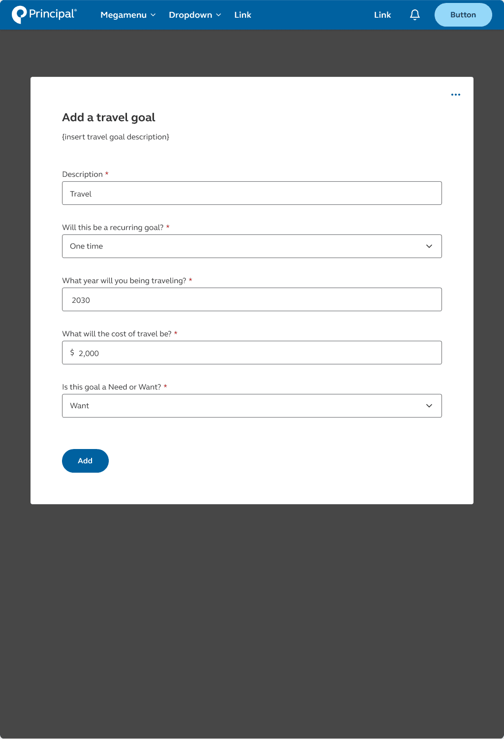
Pre-fill questions that we already have about the user (Aesthetic and minimalist design)
Align components with Principal Design System (Consistency and standards)
Remove summary page (Aesthetic and minimalist design)
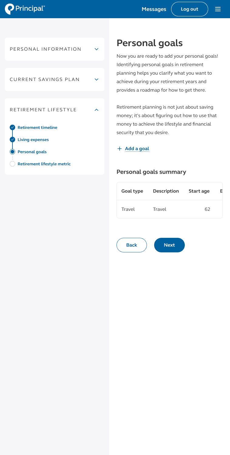
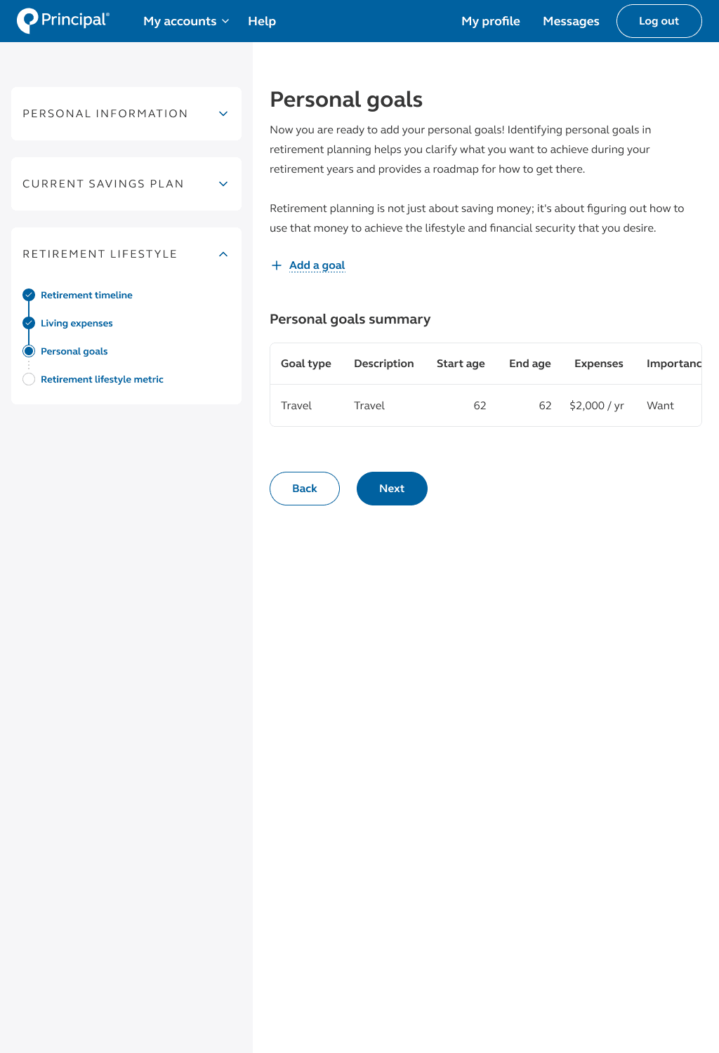
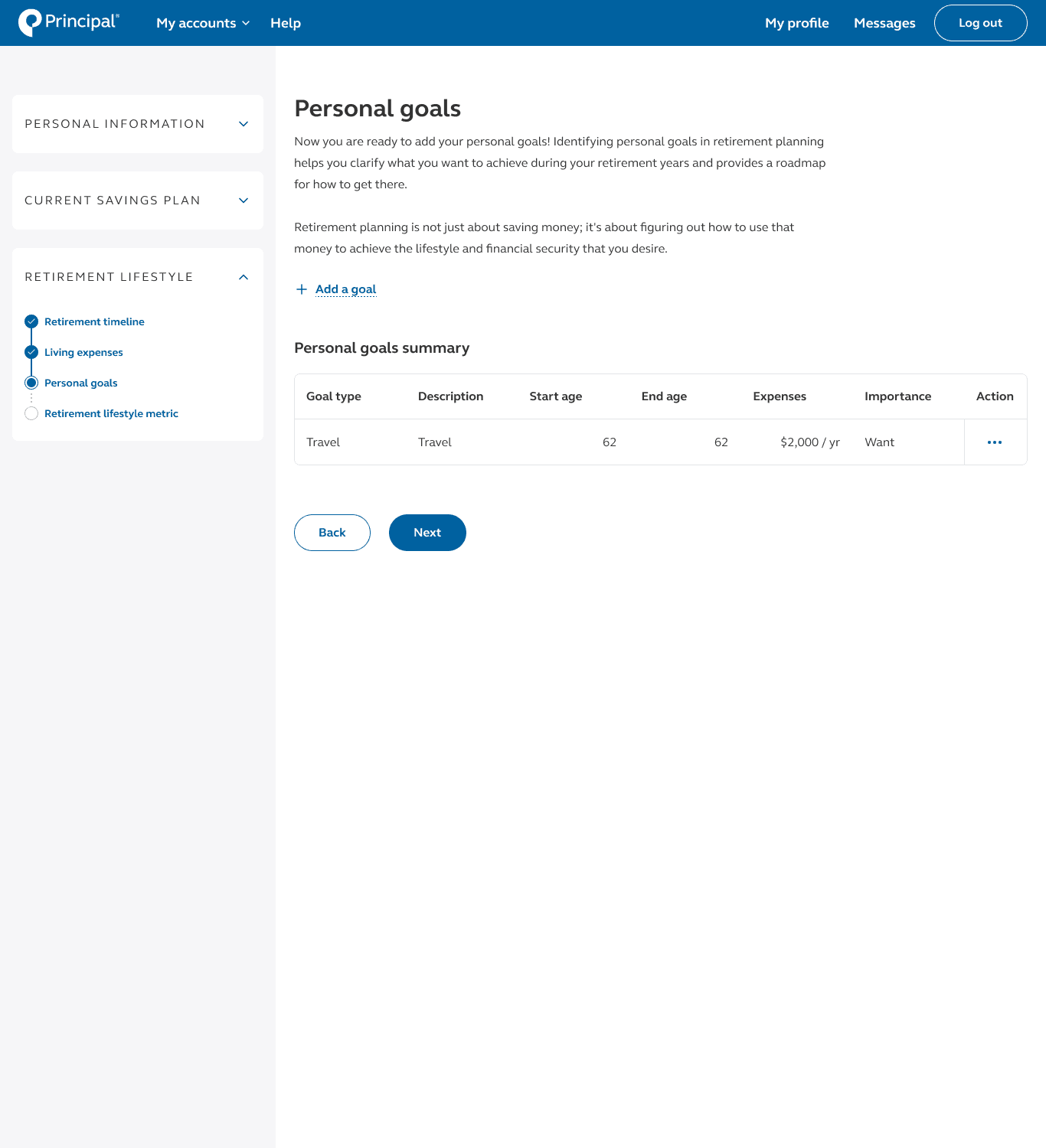
Responsive designs

Blueprint for how the retirement wellness planner will adapt and respond across different devices and screen sizes.
Conclusion

Takeaways
Synthesizing data
Synthesizing research and data collected from user interactions with the retirement wellness planner provided valuable insights into user behavior, preferences, and pain points. Effective synthesis enabled me to identify common themes, prioritize user needs, and develop targeted solutions that address the diverse needs and motivations of users.
Opportunities for innovation
Uncovering opportunities and new strategies for transforming how individuals measure their progress toward retirement goals can lead to innovative features or approaches that differentiate our planner from competitors. This included leveraging technology, gamification, or behavioral economics principles to enhance user engagement and motivation.
Iteration
In our project, we didn't follow a linear path; instead, we embraced an iterative design approach. This meant constantly refining and improving our design based on user feedback through prototyping, testing, and iteration cycles. By staying flexible and continuously adapting to user needs, we ensured our final product met the desired standards of usability and satisfaction.
Next steps
Approval and production
The next steps in this project involve obtaining approval from the program steering committee and moving towards production.
